user guide
This user guide will begin with a general discussion of the foundational elements of the program followed by a detailed instruction manual.
Please read the “operational overview” section prior to tackling this user guide.
general
The programmatic goal of seniority_list is to create relatively large data models which can be analyzed and compared. The program orders an integrated list as directed and then uses multiple algorithms to calculate the resultant metrics.
The seniority_list program is written in a procedural style and is designed to employ the Jupyter notebook as the user interface. Therefore, to use seniority_list, first launch the Jupyter notebook from the terminal (PowerShell is recommended if running Windows):
jupyter notebookA new browser window will open with a presentation of files and folders. Navigate to the seniority_list folder and then to the desired notebook file or initialize a new notebook as desired. The notebook interface provides a platform from which to run the program scripts and functions. Detailed operational instructions are located in the “notebook interface” section below.
An analysis of a particular integration will be referred to as a “case study” within the seniority_list documentation, and the particular files, data, etc. relating to that case study will be described as being “case-specific”.
Case-specific Excel input files are selected by the program for processing as directed by a case_study input variable read initially as an argument to the build_program_files.py script. The Excel input files must be formatted and located in a user-created, case-study-named folder within the excel folder so that the program can find and process them. In other words, the case_study input variable will be the same as the name of the folder containing the input Excel files and determines which input files will be used to create the foundational program files.
The input files consist of four Excel files. The actual names of the Excel input workbooks and the spreadsheets within them remain the same for all case studies. Only the name of the container folder changes and each case study has its own folder. This system allows many different case studies to exist within the program, and makes it a trivial excercise to switch between case studies, simply by changing the “case” argument to the build_program_files.py script when loading a new study into the program.
After the case-specific Excel files are in place, seniority_list is able to rapidly generate the datasets using a series of scripts as follows (simplified):
First, foundational program files are generated (pandas dataframes) and are stored as serialized pickle files within the auto-generated dill folder with the build_program_files.py script.
Next, a relatively long pandas dataframe is created from the freshly-created program files. This file is know as the “skeleton” file because it serves as the frame for all of the datasets which will be generated by the program. The skeleton file contains employee data which remains constant regardless of list order. The skeleton file is created by running the make_skeleton.py script.
Finally, datasets are generated with two scripts, one for the standalone data and one for the integrated data, standalone.py and compute_measures.py. The integrated dataset creation process will be repeated for each list ordering proposal. Both the standalone and integrated datasets will incorporate specific options and scenarios set by the user.
The process to produce the datasets may be rapidly accomplished utilizing the RUN_SCRIPTS notebook included with the program, with modifications appropriate for a particular case study. When the program is initially downloaded, the notebook is set up properly for use with the sample case study included with the program. The RUN_SCRIPTS notebook serves as a template for use within actual user case studies, as do the other program notebooks.
seniority-list includes many visualization functions which have been designed specifically for seniority list analysis. These functions are located within the matplotlib_charting and interactive_plotting modules. Most of the plotting functions are demonstrated with the sample STATIC_PLOTTING notebook.
An array of summary statistical data formulated from all outcome datasets may be generated with functions within the reports module. The REPORTS notebook contains code cells to demonstrate the summary reports functionality of seniority_list.
The editor tool allows list order analysis, editing and feedback through an interactive interface. The EDITOR_TOOL notebook is included with the program and will start the editor when it is run.
seniority_list is also able to rapidly produce “hybrid” lists with proportional weighting applied to any number of attributes through functions found within the list_builder module. A sample hybrid list is created when the RUN_SCRIPTS notebook is run.
program components and file structure
This section describes the files which make up the seniority_list program prior to and after running the program scripts.
The file components of seniority_list may be categorized as follows:
original files
function modules:
functions.py - dataset generation, editor helper routines
matplotlib_charting.py - static charting functions
interactive_plotting.py - interactive charting functions
converter.py - convert basic job data to enhanced job data
list_builder.py - formulate list proposals
reports.py - generate basic summary reports
editor_function.py - editor tool
scripts
build_program_files.py - create and format intial program dataframes from input data files
make_skeleton.py - generate framework for datasets
standalone.py - non-integrated dataset production
compute_measures.py - integrated dataset production
join_inactives.py - finalize list with inactives
Jupyter notebooks
RUN_SCRIPTS.ipynb - generate program files and datasets
STATIC_PLOTTING.ipynb - create example data model visualizations
INTERACTIVE_PLOTTING.ipynb - example interactive charts
REPORTS.ipynb - generate high-level report, visual and tabular
EDITOR_TOOL.ipynb - run the interactive editor tool
Excel input
master.xlsx - foundational employee data
pay_tables.xlsx - compensation data
proposals.xlsx - list order proposals
settings.xlsx - options and settings
generated files (all are dataframes except the .xlsx files and the dictionaries)
datasets (pandas dataframes stored as serialized pickle files)
ds_<proposal name>.pkl - integrated dataset(s) generated from proposed list orders
standalone.pkl - dataset generated with non-integrated results
reports
pay_table_data.xlsx - computed compensation data (Excel format)
final.xlsx - final list (Excel format)
final.pkl - final list (dataframe format)
ret_stats.xlsx* - retirement statistics
annual_stats.xlsx* - annual statistics
ret_charts* - retirement statistics chart images folder
annual_charts* - annual statistics chart images folder
*generated with the reports module
dictionaries
dict_settings.pkl - options and settings
dict_colors.pkl - colormaps for plotting
dict_attr.pkl - dataset attribute descriptions
dict_job_tables.pkl - monthly job counts
editor_dict.pkl - initial values for editor tool
indexed pay tables
pay_table_basic.pkl - basic job levels monthly pay
pay_table_enhanced.pkl - enhanced job levels monthly pay
proposals
p_<proposal name>.pkl - list order proposals
misc.
master.pkl - employee data
case_dill.pkl - single-value dataframe with case study name
last_month.pkl - percentage of retirement month working
proposal_names.pkl - the integrated list order proposals
seniority_list includes a sample integration case study for simulating an integration involving three employee groups. The sample case_study is named “sample3”. The sample3 folder and its contents within the excel folder contain the sample case study data.
Note
The reference to the seniority_list folder throughout the documentation refers to the seniority_list folder within the parent seniority_list folder.
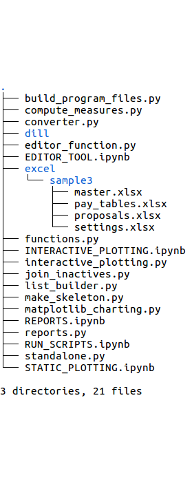
seniority_list/seniority_list/The images below display the file structure or “tree” views of the files and folders within the seniority_list folder of the program. The seniority_list folder contains all of the code used to actually operate the program. There are other files and folders located within the seniority_list folder which are of an administrative nature and have been removed from the tree views for clarity (.ipynb_checkpoints and __pycache__ folders).
The next several images will highlight the new files created as the various scripts are run. The specifics concerning the purpose and product of the various scripts will be explained later.
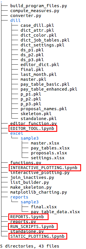
The left image below shows the tree structure of the program as it exists when initially downloaded.
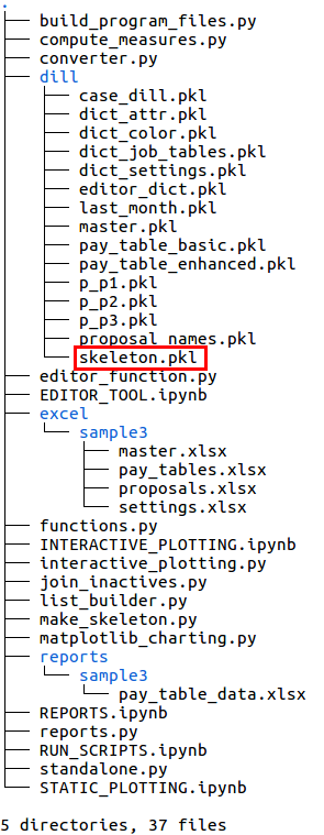
The file structure of seniority_list expands significantly when the build_program_files script is run. In the right image below, new files are shown within the red boxed areas, and new folders are shown within the green boxes. Most of the new files are pandas dataframes which have been converted to a “pickle” (.pkl extension) file format, a format which is optimized for fast storage and retrieval. All of the “pickle” files in the dill folder are cleared and replaced when a new case study is selected and calculated.
Notice a new folder, reports, has been created which in turn contains another new folder with the case study name (“sample3” in this case). This folder contains a new Excel file, pay_table_data.xlsx, pertaining to calculated compensation information.
The fact that there are three files in the dill folder beginning with “p_” indicates that three integrated list proposals were read from the Excel input file, proposals.xlsx.
initial program files
after build_program_files script
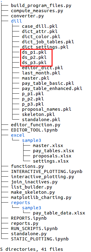
The framework upon which datasets are built for a particular case study is the “skeleton” file. The skeleton file is created with the make_skeleton.py script. The output is stored as skeleton.pkl within the dill folder, indicated in the lower left image.
Next, a “standalone” or unmerged dataset is generated which contains information for each employee group as if a merger had not occurred. This data is all in one file, standalone.pkl, as indicated in the lower right image.
after make_skeleton script
after standalone script
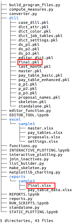
The integrated list datasets are produced with the compute_measures.py script, run separately for each integrated list proposal. The dataset file names begin with “ds_” (lower left image).
The final.xlsx and final.pkl files shown in the lower right image were generated by the join_inactives.py script. Normally these files would be created at the end of the entire analysis process when a final integrated list has been produced and the inactive employees are reinserted into the new combined list. These files contain the same information, only the file format is different - one is a pandas dataframe and the other is an Excel file generated for user convenience.
after compute_measures script
after join_inactives script
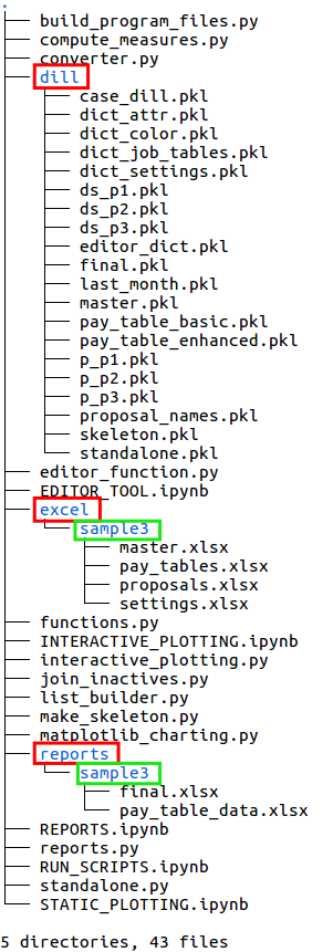
The program includes four sample Jupyter notebook files which are indicated with the red boxes below and left.
The folders within the seniority_list folder are indicated in the lower right image.
The dill folder contains the generated program files which are used by the various scripts to make the model datasets. The datasets are also stored within the dill folder once they are produced. The names and the quantity of files within the dill folder will be the same for all case studies, with the exception of case-specific proposal files (starting with “p_”) and case-specific dataset files (starting with “ds_”. The actual contents of the program files will be different for each case.
The excel folder contains a folder for each existing case study. In this view, there is only one folder, (sample3), containing the four Excel input files. If other case studies existed, there would be additional folders within the excel folder, each containing four Excel input files with the same names, but with the contents of the Excel file worksheets modified as appropriate for each case.
The reports folder will contain an auto-generated folder for each case study. The Excel files located within these folders are created by the program.
the 5 sample notebook files
program folders
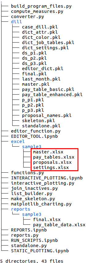
The user input files are marked in the image below and left. The four case-specific Excel files are located within a folder named after the case study (sample3) within the excel folder.
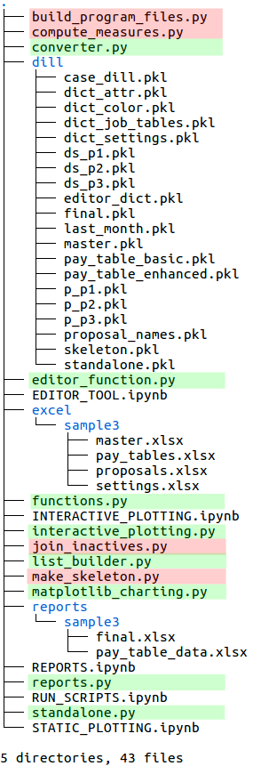
The tree view below right highlights the program scripts in red and the function modules in green. The program scripts perform most of the work of seniority_list while the function module components are used within the scripts and the Jupyter notebooks to perform specific actions.
user input files
scripts and function modules


program flow
input data
seniority_list reads user-defined input data from four Excel workbooks. These input files must be formatted and located properly for the program to run.
Note
The following discussion provides information concerning how the input files fit in with program flow. Please see the “excel input files” page of this documentation for complete descriptions and formatting requirements of the Excel input files.
The four Excel input files:
master.xlsx
basic employee data file
contains data for all employee groups within one worksheet
proposals.xlsx
order and empkey (unique number derived from employee group number and employee number)
contains one worksheet for each proposed integrated list order
pay_tables.xlsx
pay table for basic job levels
basic and enhanced monthly pay hours, descriptive job codes, full-time vs. part-time job level percentages
settings.xlsx
scalar options (single value variables)
tabular data sources to be converted to various lists and dictionaries
setup workflow summary
The basic idea is to use existing Excel input files workbooks as an easy starting point or template for new case study inputs.
Navigate to the excel folder within the seniority_list folder.
Copy the sample3 (or any other case study folder) and paste it right back into the same folder.
Rename the new folder as the new case study name.
Modify the content of the workbooks within the new case study folder to match the new case study parameters.
Input file basics
The program requires input from four prepared Excel workbooks containing employee data, pay scales, job counts, proposed integrated list orderings, and other program data and options information.
Examples of input information:
- job counts per job category per employee group- changes in job counts over time- colors to be used when plotting data- use a constant retirement age or calculate an increase at some point- an option to use basic or enhanced job levels- whether or not to assume a delayed implementation of the integrated listInput file naming and location
Data for many merger studies may be stored within seniority_list at the same time. A naming convention applied to the folders containing the Excel input files ensures that the program uses the correct data for the selected integration study.
The user will choose a case study name when preparing to analyze an employee group merger with seniority_list. For purposes of discussion, we will assume there are two companies involved in a hypothetical merger, “Southern, Inc.” and “Acme Co.”, and the case name chosen is “southern_acme”. This name will become the name of the folder which will contain the four case-specific Excel input data files.
The recommended way to create the input files for a new case study is to navigate to the excel folder, copy an existing case study input folder (the sample3 folder if no other case studies exist), then paste it back into the excel folder and rename it with the desired case study name (“southern_acme” in this case.) The user will then modify the contents of the workbooks within the case study folder to match the actual parameters of the new case study as described within the “excel input files” section of the documentation.
The names of the four files located within a case study folder are the same for all case studies: “master.xlsx”, “pay_tables.xlsx”, “proposals.xlsx”, and “settings.xlsx”. These file names should not be modified because the program will look for them specifically regardless of the case study name.
By far, the most of the effort involved when utilizing seniority_list will be directed toward preparing Excel input data for consumption by the program. However, once everything is set up, minimal effort is required to analyze multiple integration scenarios.
Selecting a case study
With the input files in place and loaded with proper information, the user selects an integration study for analysis by manually setting the “case” argument for the build_program_files.py script. The “southern_acme” case study has been selected in the example below (Jupyter notebook cell command):
%run build_program_files southern_acmeThis one argument will set up the program to select the proper source files for all of the calculations used to produce multiple data models corresponding to designated integration proposals. The user may easily switch between completely different case studies simply by changing the single argument to the build_program_files.py script and then rerunning the program. If the user desired to run the sample case study after analyzing the “southern_acme” case, he/she would rerun the script as follows:
%run build_program_files sample3After running the build_program_files script, the other scripts involved in building the datasets must be run as well, as described in the sections below. The included RUN_SCRIPTS notebook offers a template to make this process easy for any case study, with simple modification. This will be explained within the “operation” section below.
The input Excel files and the files generated by the build_program_files script relating to a specific case study provide the foundational information for the main dataset generation process.
build program files
Processing script: build_program_files.py
This script creates the necessary support files from the input Excel files required for program operation. The input files are read from the appropriate case study folder within the excel folder.
The build_program_files.py script requires one argument which designates the case study to be analyzed. That argument directs the script to look for the input files within a folder with the same name as the argument, in the excel folder.
For example, to run the script from the Jupyter notebook using the sample case study, type the following into a notebook cell and run it:
%run build_program_files sample3The files and folder created with build_program_files.py are as follows:
- from the input Excel files:
from proposals.xlsx:
proposal_names.pkl
p_<proposal name>.pkl for each proposal
from master.xlsx:
master.pkl
last_month.pkl
from pay_tables.xlsx:
pay_table_basic.pkl
pay_table_enhanced.pkl
pay_table_data.pkl
from settings.xlsx
dict_settings.pkl
dict_attr.pkl
- created with this script without reference to the input files:
from code within script:
case_dill.pkl
editor_dict.pkl
dict_color.pkl
case-study-named folder in the reports folder (if it doesn’t already exist)
descriptions of the created files:
All images may be clicked to enlarge.
The case_dill.pkl file is a tiny dataframe (only one value) containing the name of the current case study, as set by the “case” argument of the build_program_files.py script. It is referenced by the join_inactives.py script when writing the final.xlsx file within the appropriate case study folder, in the reports folder.

case_dill mini-dataframe
The proposal_names.pkl file is a very small dataframe which contains the names of the various list order proposals, obtained from the worksheet names within the proposals.xlsx input file. This file is referenced by many other functions when referencing list order proposals.
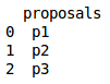
proposal_names mini-dataframe
The editor_dict.pkl file is used to set the initial values in the editor tool interactive widgets (sliders, dropdown boxes, etc.) and is modified by the editor tool when in use.
editor_dict dictionary for editor tool settings (sample values)
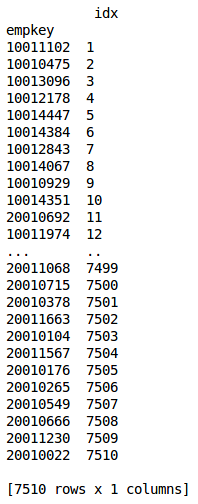
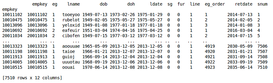
The master.pkl file is a pandas dataframe version of the master.xlsx input workbook employee list data. The dataframe structure is the same as the worksheet structure with the addition of a calculated “retdate” (retirement date) column.
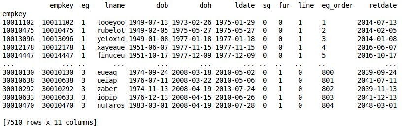
master file excerpt
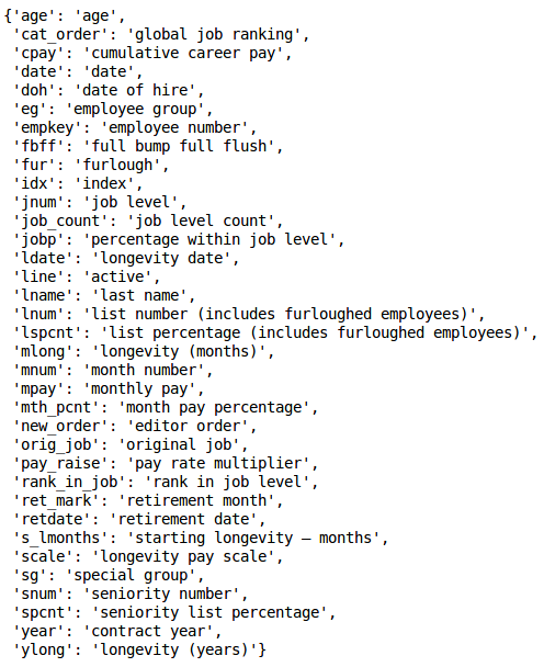
The dict_attr.pkl file is a dictionary containing dataset column names as keys and descriptions of those names as values, as delineated on the “attribute_dict” worksheet within the settings.xlsx workbook. The descriptions are used for chart labeling.
attribute dictionary
The dict_color.pkl file is a relatively large dictionary containing matplotlib colormap names to color lists key-value pairs. The color lists are in [red, green, blue, alpha] format. The color dictionary is discussed in the “visualization” section below.
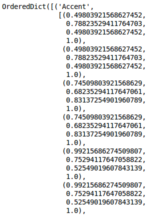
color dictionary excerpt, rgba format
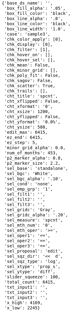
The dict_settings.pkl file is a dictionary containing program options and data necessary for seniority_list to operate. Nearly all of the data from the settings.xlsx input file ends up in this dictionary, either in native format or as a modified format as a calculated derivative or reshaped as elements within a Python data structure (or both).
settings dictionary excerpt
The dict_job_tables.pkl file is a dictionary containing data related to monthly job counts. The dictionary values are numpy arrays pertaining to both standalone and integrated employee groups, incorporating changes in the number of jobs over time as described with the job_changes worksheet within the settings.xlsx input file. These arrays are referenced during the job assignment and analysis routines.
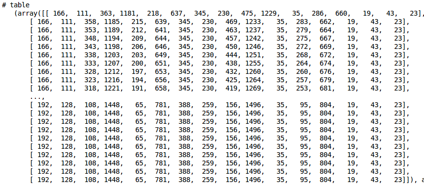
one of multiple arrays within the job table dictionary
A dataframe is created from each proposed integrated list order as indicated on the worksheets within the proposals.xlsx workbook input file. (p_p1.pkl, p_p2.pkl, p_p3.pkl with the sample case)
proposal file excerpt
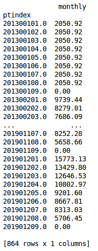
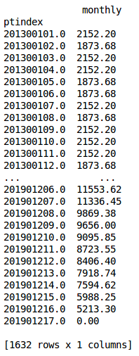
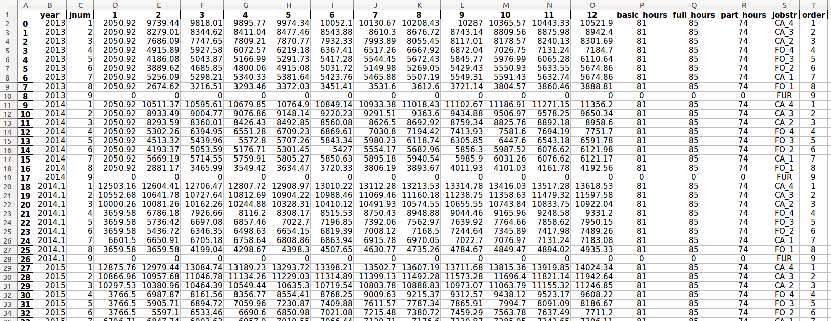
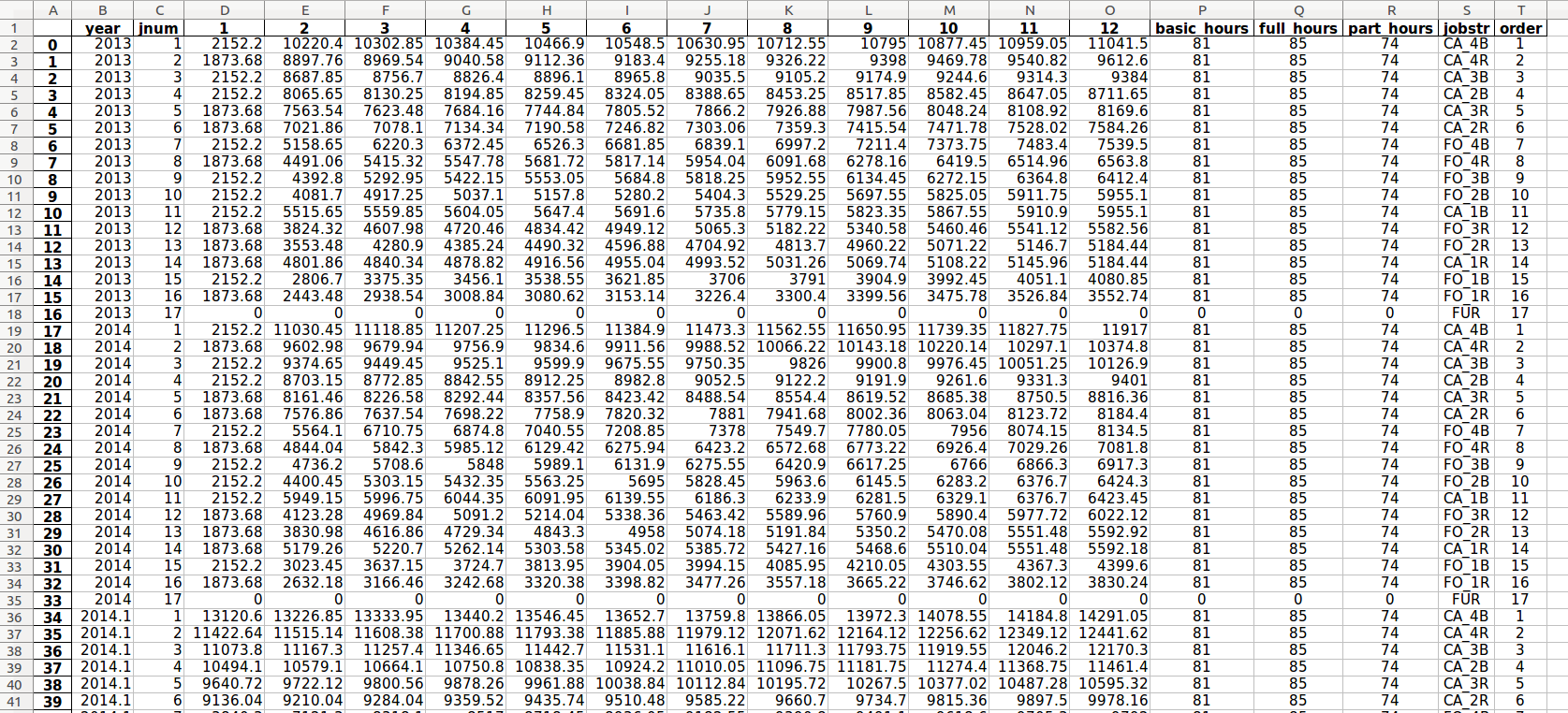
The pay_table_basic.pkl and pay_table_enhanced.pkl files are calculated indexed compensation dataframes derived from the pay_tables.xlsx Excel input file. These files provide rapid data access during the dataset creation routine.
“Indexed” means that the index of the dataframe(s) contains a unique value representing the year, longevity step, and job level. The only column (“monthly”) contains the corresponding monthly compensation value.
The “ptindex” (pay table index) contains year, longevity, and job level information. The last two whole digits represent the job level. In this example case, there are 8 basic levels and 16 enhanced levels.
indexed basic pay table
indexed enhanced pay table
A decimal representing the portion of an employee’s final work month may be calculated using retirement date and the number of days in the retirement month. This decimal is calculated for all employee retirement dates and stored in last_month.pkl (the “last_pay” column below) to be used when calculating dataset career earnings attribute.
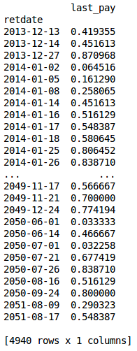
last_month file excert
The join_inactives.py script reinserts inactive employees into a combined seniority list order and creates two files containing the final integrated seniority list. Both files are the same - one is a pandas dataframe (final.pkl) and the other is written to disk in the reports folder as an Excel workbook (final.xlsx). See the “building_lists” section below for more information concerning the join_inactives.py script.
final file excerpt, dataframe version
pay_table_data.xlsx (program-generated workbook)
seniority_list calculates total monthly compensation tables which are the source for the pay_table_enhanced.pkl file and pay_table_basic.pkl files (above) used when generating compensation attributes within datasets. The monthly compensation data may be reviewed on one of the worksheets from the auto-generated pay_table_data.xlsx workbook within the reports folder. (Note that a furlough pay level has been added by the program for each year.)
pay_table_data.xlsx example, “basic ordered” worksheet
The expanded monthly compensation table for enhanced job levels is generated by seniority_list automatically. The job level sort (ranking) will be consistent for all years and will be based on a monthly compensation sort for a year and longevity selected by the user.
“Enhanced” job levels delineate between full- and part-time positions within each basic job level. See the discussion within the “pay_tables.xlsx” section on the “excel input files” page of the documentation for further explanation.
pay_table_data.xlsx example, “enhanced ordered” worksheet
The “job_dict” worksheet information serves as the calculated source for the basic-to-enhanced job level conversion process when required.
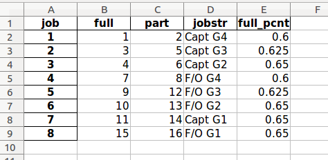
pay_table_data.xlsx example, “job_dict” worksheet
Other worksheets are contained within the pay_table_data.xlsx workbook within the reports folder for user review.
creating the static ‘skeleton’ file
Processing script: make_skeleton.py
Columns created:
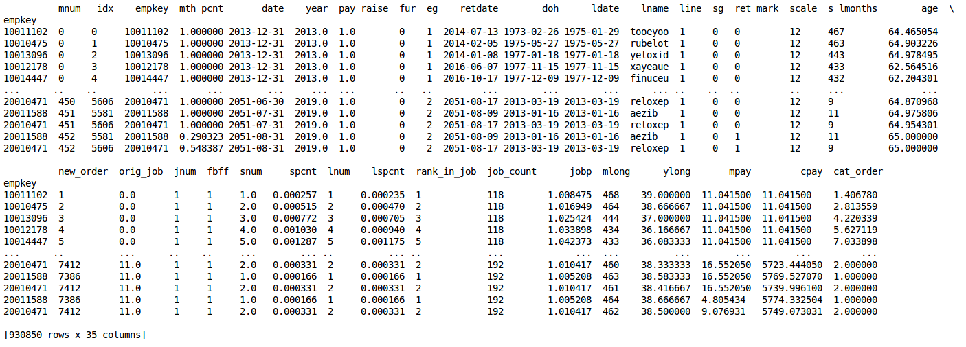
['mnum',
'idx',
'empkey',
'mth_pcnt',
'date',
'year',
'pay_raise',
'fur',
'eg',
'retdate',
'doh',
'ldate',
'lname',
'line',
'sg',
'ret_mark',
'scale',
's_lmonths',
'age']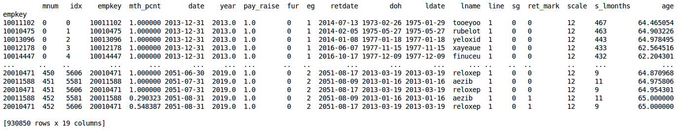
skeleton file excerpt
To run the script from the Jupyter notebook, type the following into a notebook cell and run it:
%run make_skeletonThe skeleton.pkl file is a dataframe containing employee data that is independent of list order, meaning that such information is a constant for each individual employee throughout any data model. An example of this would be employee age.
The skeleton file can initially be in any integrated order, but the members of each employee group must be in proper relative order to each other. In other words, the sort order of the members from any employee group must be maintained no matter how the employee groups are meshed together in an integrated list.
The skeleton file is a relatively “long” dataframe. With the sample case study of 7500 total employees, it is almost one million rows long. The skeleton file is organized by data model month (“mnum”), starting with the data for the first month and sequentially “stacking” sequential month data below. The size (number of rows) of the data for each month is directly related to the number of employees who remain active (non-retired) in that month.
Much of the information in the skeleton file is constant from month-to-month, such as date of hire and last name. Other data does change, such as date and age.
The index of the skeleton is purposefully a duplicate index of the empkeys column(unique employee ID).
Because the skeleton file contains data which is unaffected by the order of an integrated list, it may be calculated once and simply retrieved and resorted to form the basis of subsequent integrated list datasets.
The skeleton file is utilized in the production of both standalone and integrated datasets.
creating datasets
Processing scripts: standalone.py, compute_measures.py

high-level dataset creation flowchart
Dataset creation is the heart of seniority_list, producing a collection of metrics calculated from a particular integrated list ordering proposal, including any job assignment conditions associated with that proposal, or from standalone list data. The datasets become the source for the objective analysis of potential integrated lists and associated conditions. Integrated datasets are generated using the compute_measures.py script. Standalone datasets are generated using the standalone.py script.
integrated dataset file excerpt
Note that seniority_list assigns list percentages and job ranking numbers near zero to the best, most “senior” positions, and higher percentages and numbers to less desirable, most “junior” positions.
Integrated datasets
Integrated datasets build upon a properly-sorted skeleton file. Integrated dataset construction is highly dependent on list order.
The program uses the proposed integrated list orderings from the proposals.xlsx workbook to sort the framework for a proposal dataset prior to calculating all of the various attributes which are utilized for analysis. seniority_list may also process list orderings from other sources (the editor tool and the list_builder.py script).
The technical process to resort the skeleton file is as follows:
Use the short-form “idx” column from either a proposed list or the “new_order” column from an edited list to create a new column, “new_order”, within the long-form skeleton dataframe.
The ordering information column data from either the proposed or edited list is joined into the skeleton with the pandas data alignment feature using the common empkey indexes. The skeleton may then be sorted by the month (“mnum”) and the “new_order” columns.
The generic command to create an integrated dataset is as follows:
%run compute_measures <proposal_name>The compute_measures.py accepts up to three arguments specifying job assignment conditions from the following list:
['prex', 'ratio', 'count']The arguments correspond to the ‘prex’, ‘ratio_cond’, and ‘ratio_count_capped_cond’ job assignment conditions described within the ‘settings.xlsx’ portion of the ‘excel_input_files’ section of the documentation.
The following command would run the script for proposal “p1” with both pre-existing and a ratio job assignment conditions as specified in the settings.xlsx input file:
%run compute_measures p1 prex ratioOther options for integrated dataset construction are defined via the input files, such as job change schedules and recall schedules.
Standalone datasets
Standalone datasets for each separate employee group are also created by the program for comparative use. The creation process is very similar to the integrated process described above, with the exception of the integrated list sorting and job assignment by employee group. After the standalone datasets are created, they are combined into one dataset (retaining the standalone metrics), permitting simple comparison with any integrated dataset.
The following command would create a standalone dataset with a pre-existing job assignment condition. The condition “prex” argument is optional, and is the only conditional argument accepted by the standalone.py script.
%run standalone prexdataset attributes (columns)
The program generates many attributes or measures associated with the data model(s). These calculated attributes become the source for data model analysis. The attributes marked with an asterisk in the list below are precalculated within the skeleton file. The remaining attributes below are calculated and added to a sorted skeleton file as columns when a dataset is created.
mnum* - data model month number
idx* - index number (associated with separate group lists)
empkey* - standardized employee number
mth_pcnt* - percent of month for pay purposes (always one except for pro-rated retirement month)
date* - monthly date, end of month
year* - contract year for pay purposes
pay_raise* - additional (or reduced) modeled annual pay percentage
fur* - furloughed employee, indicated with one or zero
eg* - employee group numerical code
retdate* - employee retirement date
doh* - date of hire
ldate* - longevity date
lname* - last name
line* - active employee, indicated with one or zero
sg* - special treatment group, indicated with one or zero
ret_mark* - employee retirement month, indicated with one or zero
scale* - employee longevity year for pay purposes
s_lmonths* - employee longevity in months at starting date
age* - age for each month
snum - seniority number for each month
mlong - employee longevity in months for each month
ylong - employee longevity in decimal years for each month
new_order - order of integrated list or edited integrated list
orig_job - employee job held at starting date (or at implementation date for the data model months after a delayed implementation)
jnum - job (level) number
spcnt - monthly seniority percentage of list (active only, most senior is .0, most junior is 1.0)
lnum - monthly employee list number, includes furloughed employees
lspcnt - monthly percentage of list, includes furloughed employees
job_count - monthly count of jobs corresponding to job held by employee
rank_in_job - monthly rank within job held by employee
jobp - monthly percentage within job held by employee
cat_order - monthly employee job ranking number (rank on list organized from best job to least job)
mpay - monthly employee compensation
cpay - career pay (cumulative monthly pay)
These attribute names and their definitions are stored within the dict_attr.py file, generated with the build_program_files.py script.
filtering and slicing datasets
Datasets are large pandas dataframes and may be sliced and filtered in many ways. The user may be interested in reviewing the pandas documentation concerning indexing and selecting data from dataframes (and series) for more detailed information. One of the more common methods particularly helpful with the seniority_list datasets is boolean indexing. Boolean (True/False) vectors may be created by specifying attribute column value parameters within the bracket symbols. Only rows matching a True condition will be returned as part of the new, filtered dataset.
For example, to retrieve all of the data from a dataset named “ds” where employee age was greater than or equal to 45 years:
ds[ds.age >= 45]If an additional filter is desired, it can be added by enclosing both filters with parentheses, joined with the “&” symbol. This filter slices for employees greater than or equal to 45 years of age and who belong to employee group (“eg”) 1:
ds[(ds.age >= 45) & (ds.eg == 1)]Filtered datasets may be assigned to a variable and then further ananlysis conducted on that particular subset of the original dataset. One common usage for this new filtered dataset variable would be as the dataframe input for a plotting function.
visualization
The seniority_list data models are full of calculated metrics ready to be analyzed. The pandas dataframe format was specifically designed for data analysis, and the user is encouraged to explore the datasets with the many methods available with the python scientific stack. In addition to these user-defined analysis techniques, seniority_list offers over 25 built-in visualization functions which may be used to produce highly customizable charts. One of the notebooks included with the program, STATIC_PLOTTING.ipynb, demonstrates some of the capability of these functions in an editable format. The INTERACTIVE_PLOTTING.ipynb notebook contains interactive charts. Please explore the docstrings for specific descriptions of the capabilities, inputs, and options available.
The built-in plotting fuctions follow a default layout convention when applicable, as indicated below:
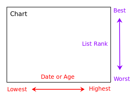
default layout for built-in plotting functions
In the case where a chart x-axis represents list percentage or job ranking, ordering is presented worst to best, left to right.
As mentioned previously, the plotting functions may receive pre-filtered datasets if the user desires to study a specific subset. Additionaly, many of the functions contain built-in filtering arguments to make this option more convenient.
Example plotting function definition with attribute filtering arguments:
def stripplot_eg_density(df,
                         mnum,
                         eg_colors,
                         ds_dict=None,
                         attr1=None,
                         oper1='>=',
                         val1=0,
                         attr2=None,
                         oper2='>=',
                         val2=0,
                         attr3=None,
                         oper3='>=',
                         val3=0,
                         bg_color='white',
                         title_fontsize=12,
                         suptitle_fontsize=14,
                         xsize=5,
                         ysize=10):
The “attrx”, “operx”, and “valx” (substitute x for a common number: 1, 2, or 3) inputs allow the user to specify a dataset filtering operation by specifying the attribute, operator, and value respectively.
For example, in the function argument excerpt below, the visualization would only include employees with a longevity date less than or equal to December 31, 1986.
attr1='ldate', oper1='<=', val1='1986-12-31',The following code example demonstrates how the function above could be used within a Jupyter notebook cell to filter the input “p1” dataset to include only employees who are at least 62 years old:
import matplotlib_charting as mp

mp.stripplot_eg_density('p1',
                        40,
                        eg_colors,
                        attr1='age',
                        oper1='>=',
                        val1='62',
                        ds_dict=ds_dict,
                        xsize=4)
The slice_ds_by_index_array function permits another type of specific filtering relating to a certain condition existing within a particular month. The function will find the employee data which meets the selected criteria within the selected month, and then use the index of those results to load data from the entire dataset for the matching employees. For example, a study of the global metrics for only employees who were older than 55 years of age during month 24 could be easily performed. The output of this function is a new dataframe which becomes input for other analysis functions.
seniority_list offers a wide range of chart plotting color schemes. A color dictionary is created as part of the build_program_files.py script with matplotlib colormap names as keys and lists of colors as values. All matplotlib colormaps (87 as of September 2017) are now available for plotting. Each color list is automatically generated with a length equal to the number of job levels in the data model + 1. This supplies a color for each job level plus an additional color for a furlough level. Additional customization of the colormaps is available - please see the matplotlib_charting.py module plotting function make_color_list docstring for full information. To use one of the generated colormaps, call cdict[“<colormap name>”] where “cdict” is a variable pointing to the color dictionary.
The “example gallery” section of the documentation showcases more of the visualization capabilities of seniority_list.
The visualization functions are located within the matplotlib_charting.py module.
editor tool
seniority_list excels at outcome analysis of integrated list proposals. A powerful additional feature of seniority_list is the ability to easily modify list ordering and conditional inputs in order to achieve equitable outcome results. This task is accomplished through the use of the editor tool. The editor tool allows the user to make precise adjustments to integrated list order segments through an intuitive, interactive, and iterative visual process. The integrated outcome result for each modification is presented to the user in near real time, for further analysis and editing.
After a change or edit has been made to an integrated list proposal, the editor tool creates a completely new outcome dataset based on that modification. The user then selects attributes from the new dataset to be viewed and measured and/or compared to another dataset. The tool will display the results for each employee group independently within the main chart area.
For example, the need for an adjustment to a proposed integrated list may be indicated when its differential outcome result reveals significant loss for one work group in terms of job opportunities, career compensation, or another job quality metric while showing significant gains in the same areas for another group. Outcome inequities will certainly exist when a strict formula(s) is applied when combining lists, unless each employee group list contains a relatively equivalent distribution of age, hiring patterns, and jobs. Inequities may also exist due to one or more of the parties attempting to gain advantage for members of their own group at the expense of the other group(s). Whatever the cause, it is relatively easy to alleviate or eliminate outcome equity distortions with the editor tool.
By utilizing the recursive editing feature of the editor tool, the user may create entirely new integrated list proposals with objective, quantifiable, and balanced outcomes. Outcome results are observable directly within the tool interface and may be easily validated with the other analysis capabilities of seniority_list.
The editor tool is used within the Jupyter notebook and is run as a bokeh server application usinge the editor function from the editor_function module. Optional styling arguments may be passed to the function but are not required for it to run.
The bokeh FunctionHandler and Application class objects are used to run the editor within the notebook, along with the functools “partial” method which permits optional editor function arguments to be used.
import editor_function as ef
from functools import partial

from bokeh.application import Application
from bokeh.application.handlers import FunctionHandler

from bokeh.io import show, output_notebook

output_notebook()

handler = FunctionHandler(partial(ef.editor,
                          #insert editor function arguments here as desired...
                         ))

app = Application(handler)
show(app)
There is no limit to the number of “edits” which may be accomplished - the user may recursively apply as many large or small adjustments as are needed to achieve the desired results. Additionally, the tool may be reset to an original unedited list proposal at any time, so that the user may freely explore the tool confidently.
The editor tool is able to incorporate job assignment conditions (conditions and restictions) within modified list outcomes. (See the “applying conditions” section below).
Outcome values may be displayed within the main chart area using either an absolute (actual) attribute outcome of a list proposal, or a comparative differential attribute result between two proposals. The user may quickly switch between the two views using a dropdown selection and button click.
The tool offers a filtering feature so that attribute cohorts from each employee group may be isolated and measured. For example, this capability permits comparison of employees from each group hired before a selected year, holding a specific job, or display of selected data relating to a particular data model month.
Animation of monthly data model results, hovering over data points for tooltip information, real-time adjustment of chart colors and element sizing, and other interactive exploration features are included with the tool.
Note
There is a notebook included with seniority_list, EDITOR_TOOL.ipynb, which makes it easy to open the tool.
The editor tool interface consists of input controls, the main chart, and a distribution density chart.
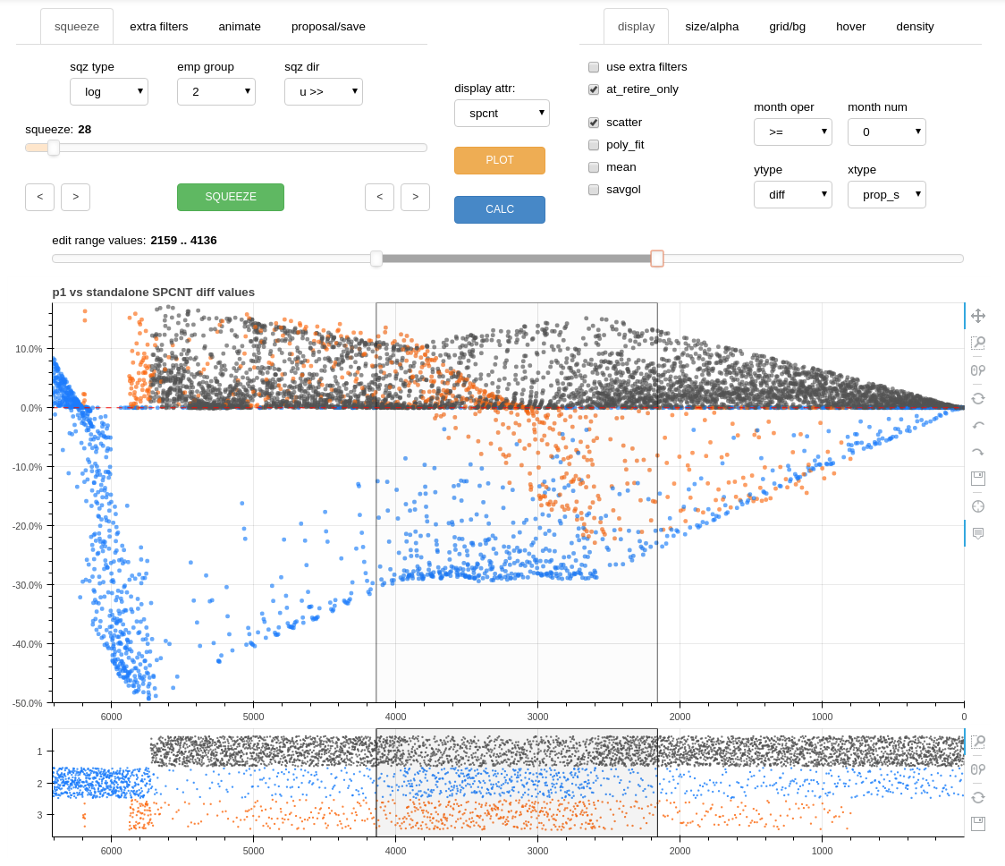
the editor tool interface
The following flowchart presents the overall list editing process. The sections below will describe the process in detail.
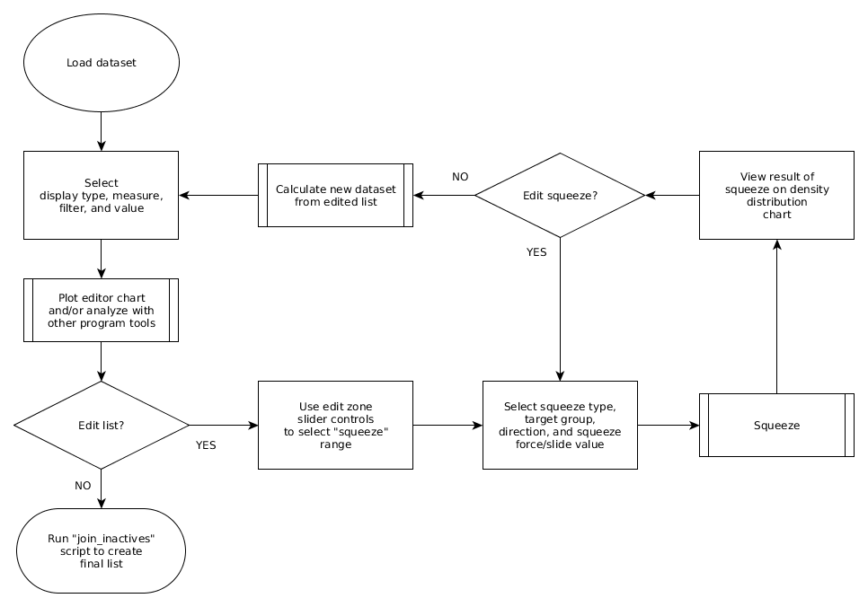
list editing process
Files created/updated by the editor tool:
With “CALC” button:
p_edit.pkl
editor_dict.pkl
With “SAVE EDITED DATASET” button:
p_edit.pkl
editor_dict.pkl
ds_edit.pkl
With “SAVE EDITED ORDER to proposals.xlsx” button:
proposals.xlsx (add or replace an “edit” worksheet)
Note: Edited datasets are not automatically saved. The user must click on the “SAVED EDITED DATASET” button (located on the proposal/save tab) to preserve an edited dataset. Previously saved edited datasets will be overwritten unless the ds_edit.pkl file is first moved outside of the dill folder.
the editor tool controls
The editor function itself accepts some arguments, but most of the interaction with the editor tool will be through the editor tool controls, consisting of various sliders, dropdowns, checkboxes, and buttons.
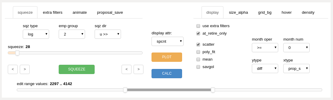
The editor controls are grouped into several sections consisting of the upper left panels, the center section, the upper right panels, and the edit zone slider along the spanning the bottom of the control area.
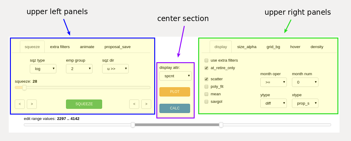
editor control grouping with the edit zone slider at the bottom (unmarked)
Many editor tool controls are contained within subpanels, selectable by tabs at the top of the tool.
The controls will be introduced below, proceding left to right as they appear within the editor tool. Details on how to use the controls will be covered in the next section.
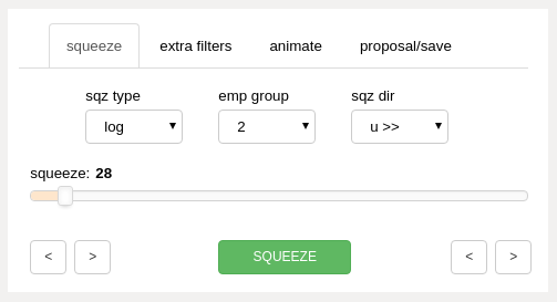
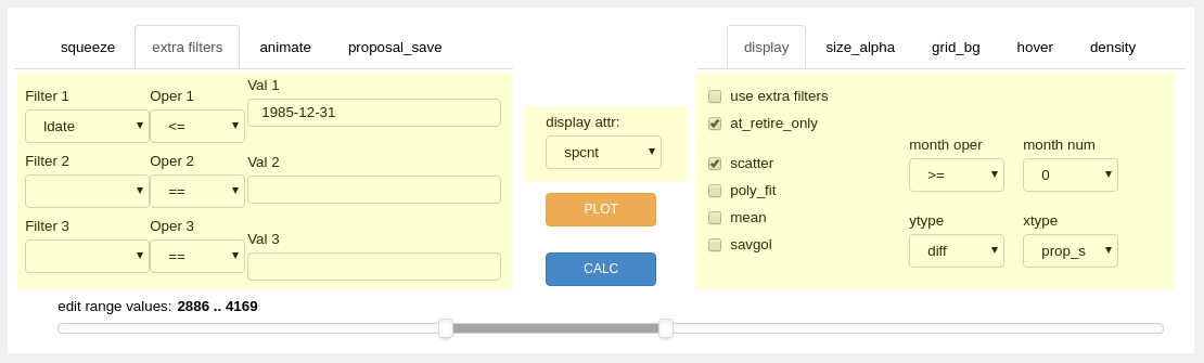
squeeze panel
This panel is used extensively during the editing process.
squeeze panel (upper left panels)
- sq type dropdown
- log
select a log or incremental packing squeeze operation
- slide
select a defined positional movement squeeze operation
- emp grp dropdown
select the employee group (integer code) to move within the selected section of the integrated list
- sqz dir dropdown
select the direction of movement for the squeeze operation
- squeeze slider
adjust the single slider control to control:
squeeze force if the “sq type” dropdown is set to “log”
list position movement if the “sq type” dropdown is set to “slide”
- edit range toggle buttons
precisely adjust the edit zone cursor lines on the main chart
- “SQUEEZE” button
command the program to execute a squeeze (list order modification)
extra filters panel
The main chart display output may be further filtered by the inputs on this panel.

extra filters panel (upper left panels)
- attribute dropdowns
select the dataset attribute to filter
- operator dropdowns
select the mathematical operator to use for the filter
- value input boxes
type in the value limit for the filter
The additional filters will not work unless the “use extra filters” checkbox is checked on the “display” panel.
animate panel
The editor tool is able to display results for any data model month. The animate feature brings this information to life. Monthly results may be quickly displayed sucessively by user controlled forward and backward buttons, automatically with a “PLAY” button, or through the use of a slider control. Outcome results over time may be quickly understood, providing rapid insight into equity distortions or validation of equitable solutions, and everything in between.
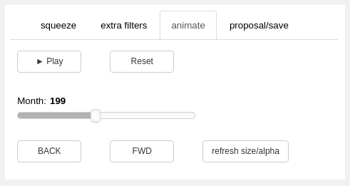
animate panel (upper left panels)
- Play button
advance through the data model one month at a time
button text will display “Pause” while the animation is running
- Reset button
reset the data model month to the starting month, month zero.
- animation slider
use the slider to move forward and backward in time
- BACK and FWD buttons
move one month in time either direction
- refresh size_alpha button
if the size or transparency of the scatter markers has been changed using the sliders on the size_alpha tab, use this to apply the changes to the animation output for all months of the data model. Otherwise, only the current month displayed will use the size and alpha selected by the size_alpha sliders.
proposal_save panel
The proposal_save tab contains controls providing inputs related to list orderings and datasets as follows:
selecting and creating the datasets used by the editor tool
preserving the results of the editing process
proposal_save panel (upper left panels)
- baseline dropdown
select the dataset to use
- conditions dropdown
select conditions to apply to proposal dataset
‘none’: no conditions
‘prex’: prex
‘count’: count
‘ratio’: ratio
‘pc’: prex, count
‘pr’: prex, ratio
‘cr’: count, ratio
‘pcr’: prex, count, ratio
- proposal dropdown
edit
use the most recent edited dataset as the starting point for each successive list modification
the program automatically selects “edit” when a squeeze operation is performed
<other dataset names>
display comparative or absolute results for other precalculated datasets
- SAVE EDITED DATASET button
Saves the following files to the dill folder:
p_edit.pkl
editor_dict.pkl
ds_edit.pkl
- SAVE EDITED ORDER to proposals.xlsx button
Adds/updates an “edit” worksheet to:
proposals.xlsx
center section
center section dropdown and buttons
- display attr dropdown
select the dataset attribute for display within the main chart
- PLOT button
show analysis results as determined by other control inputs
- CALC button
calculate a dataset after a change of list order, conditional job assignment, or proposal inputs
display panel
display_panel (upper right panels)
The display panel contains checkboxes on the left and dropdowns on the right, further divided into upper and lower sections.
upper left
- filter checkboxes
- use extra filters
if checked, use additional filtering as selected on the “extra filters” panel
- at_retire_only
if checked, only show results for employees in last month of employment before retirement
lower left
- display type checkboxes
- scatter
show results with scatter markers, one marker per employee, color coded by employee group
- poly_fit
show a polynomial fit line for each group
- mean
show an exponential moving average line for each group
- savgol
show a smoothed Savitzky-Golay filter line for each group
upper right
- month filter dropdowns
- month oper
filter data model month using selected mathmatical operator
- month num
select data model month for filtering
lower right
- axis display type dropdowns
- ytype
- diff
select a differential or comparative result display relative to baseline dataset
- abs
select a view of results from proposal or edited dataset only (no comparison)
- xtype
- prop_s (proposed order, “static” or “starting”)
x axis shows original (data model starting month) positioning for results
- prop_r (proposed order, “running”)
x axis shows updated position for selected data model month
- pcnt_s (proposed order, “percentage”)
same as “prop_s”, but showing list percentage vs list position
- pcnt_r (proposed order, “running percentage”)
same as “prop_r”, but showing list percentage vs list position
size_alpha panel
The controls on this tab control the size and alpha (transparency) of the scatter markers within the main chart.
size_alpha panel (upper right panels), number of sliders will vary with number of employee groups merging
- sliders
the vertical sliders are color-matched to each employee group color
each employee group within the data model will have a pair of sliders:
“S” will adjust the size of the scatter markers on the main plot
“A” will adjust transparency (alpha) of the scatter markers
the program will automatically create the proper number of sliders for each case study
- Reset button
set size and alpha sliders to default values
- <S and S> buttons
decrease or increase the size of all markers
- <A and A> buttons
decrease or increase the alpha value of all markers
Size/alpha adjustment occurs immediately on the main chart (no need to use plot button).
grid_bg panel
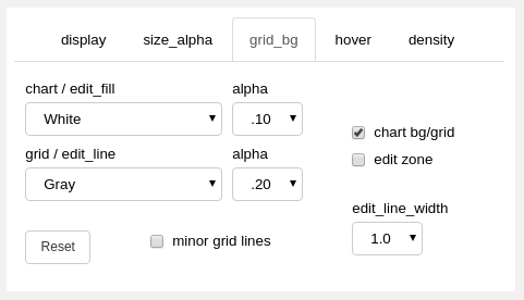
grid_bg panel (upper right panels)
- chart bg/grid and edit zone checkboxes
apply the “chart / edit_fill” or “grid / edit_line” color and alpha value to the checked areas.
the updates only occur when a color value or alpha value changes
if “chart bg/grid” is checked, the top color dropdown controls the chart background color and the bottom color dropdown controls the chart grid color
if “edit zone” is checked, the top color dropdown controls the color of the fill between the edit zone cursors and the bottom color dropdown controls the color of the cursor lines
- chart / edit_fill dropdown
select the color of the corresponding areas
- grid / edit_line dropdown
select the color of the corresponding areas
- alpha dropdowns
select the alpha (transparency) of the corresponding areas
- Reset button
reset the colors, alphas, and edit_line_width to default values
- minor grid lines checkbox
show minor grid lines when checked
color and alpha is locked to main grid line color and alpha as they exist when checkbox is checked
- edit_line_width dropdown
select the width of the edit zone cursor lines
Grid/bg adjustment occurs immediately on the main chart (no need to use plot button).
hover panel
The hover feature will provide selected data as tooltips when the mouse cursor is positioned over a scatter marker.
Use the “PLOT” button to refresh/include selected hover attributes within calculated chart data. Ensure that the chart hover tool is active to display tooltips (click on hover tool icon to display vertical blue line next to the icon).
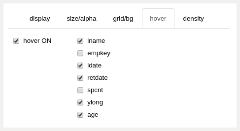
hover panel (upper right panels)
- hover ON checkbox
turn the hover feature on and off
unchecking this feature when it is not needed will slightly improve the performance of the editor tool
- hover attributes checkboxes
select the attributes to display as tooltips
if the chart display attribute is the same as a selected hover attribute, the hover attribute will not display as a tooltip
density panel
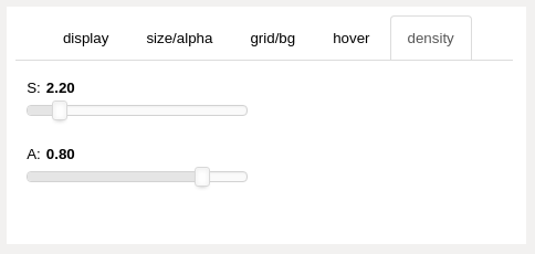
density panel (upper right panels)
- “S” slider
controls the stripplot (density) chart marker size
- “A” slider
controls the stripplot chart marker alpha (transparency)
Density adjustment occurs immediately on the density chart (no need to use plot button).
edit zone slider
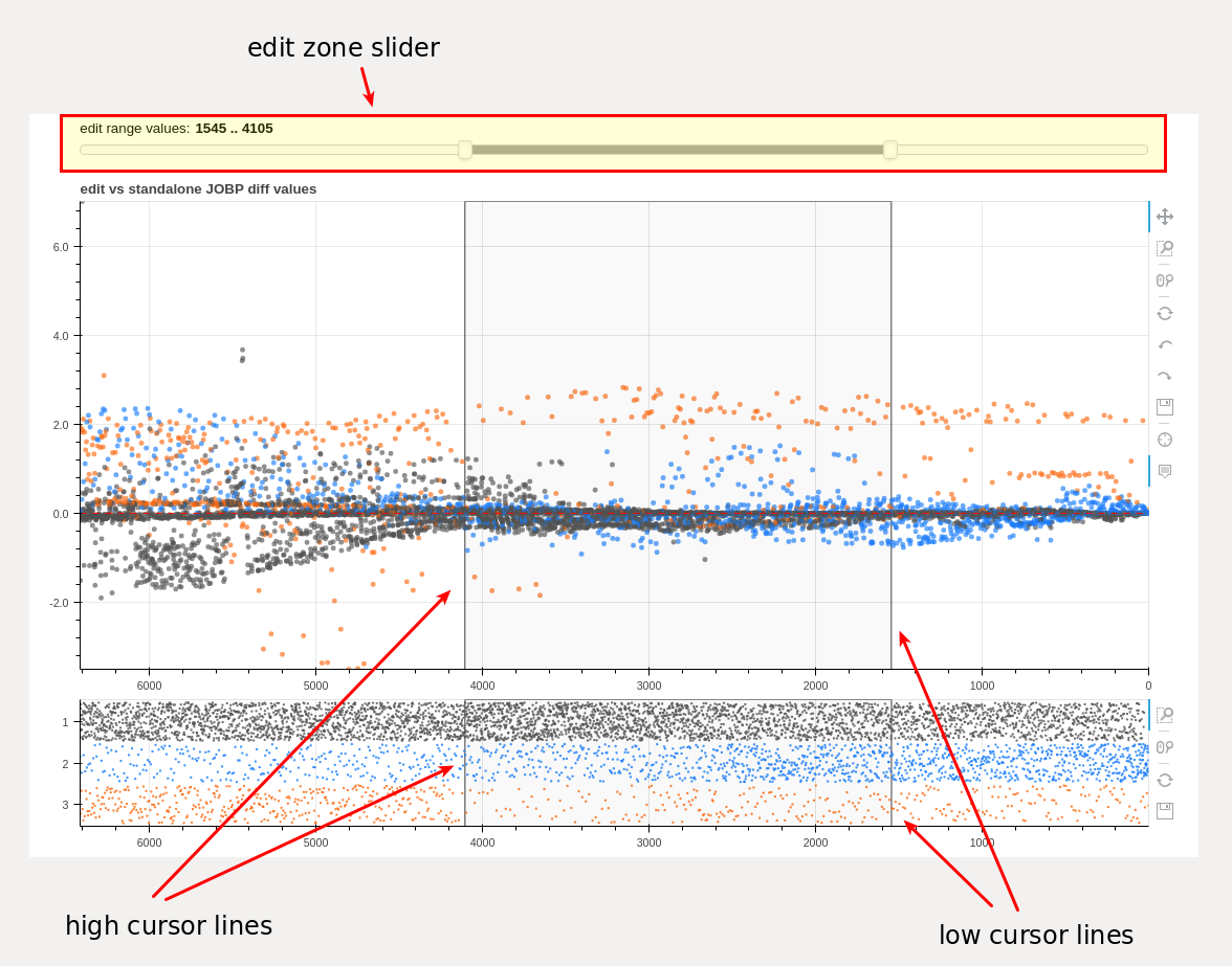
edit zone slider and chart cursor lines delineating the edit zone
The edit zone slider is used to select a section of an integrated list proposal. The selected section is used by the “squeeze” routine when editing list order.
Each end of the slider range may be adjusted independently with a mouse click and drag of an end handle or the entire range may be moved with a click and drag of the slider section between the end handles.
The slider movement is used to position vertical cursor lines within the main and density charts in real time. If data for a future month is displayed within the main chart, future list positioning data is converted for correct display within the density chart which always displays data for the complete integrated list proposal. Therefore, the main chart cursor lines and the density chart cursor lines will often be misaligned vertically. This is normal due to different x axis scaling between the charts.
Precise adjustment of the cursor lines is available with the toggle buttons found on the “squeeze” panel.
using the editor tool
The editor tool is really an analysis tool and a corrective/creative tool in one. Datasets which have already been generated can be analyzed in many ways, both by themselves and compared to each other without any editing taking place. When equity outcome distortions are apparent, the tool may be used to adjust input list order to reduce the distortions. A new outcome dataset is created based on the modified input, which is in turn available for analysis and further modification. The end result may be an entirely new list proposal which has been created by the editor tool based upon outcome equity measurements.
Common actions when using the editor tool include:
apply various filters to datasets and then click the “PLOT” button to see the results
set tooltips to “hover to discover” further information associated with each employee scatter marker - use the “PLOT” button to load
select an “edit zone” using the edit zone slider and modify list order input by using the “SQUEEZE” button, then calculate the outcome with the “CALC” button
animate outcome datasets over time
adjust colors and sizes of many of the chart elements in real time
compare datasets or simply see the results for one dataset using the “ytype” selection
control the x axis display to show original list position or an updated future list position
The normal workflow centers on editing the integrated list order using the controls on the “squeeze” panel and checking the results using the “display attr” dropdown with the “PLOT” button. With practice, the user will find that using the tool is relatively easy and visually intuitive.
Datasets (models) for use within the editor tool are specified with the “baseline” and “proposal” dropdown selections on the “proposal_save” panel.
If “edit” is selected from the “proposal” dropdown, and an edited dataset is not found by the program, the program will default to the first of the integrated datasets listed within the proposal_names.pkl file as a starting point. After the first “calculate” button execution, the program will automatically use the newly created “ds_edit” dataset for each subsequent operation.
attribute selection

the editor display attribute dropdown control
display attribute selector
- display attr dropdown
-select the dataset attribute to display within the main chart
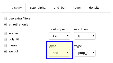
This selection controls the metric (attribute) values which will be displayed within the main chart. To display a different attribute, use the dropdown to pick another measurement and then click the “PLOT” button. Possible attribute selections include list percentage, career compensation, job levels, and others. Further filtering (see below) is available to limit displayed results to a particular month, group, or other targeted attribute(s). In the image below, note that to the right of the dropdown, a filter has been set to show only employees in their retirement month (“ret_only” checkbox). The differential chart is presenting information associated with the final month seniority list percentage (“spcnt”) for all employees.
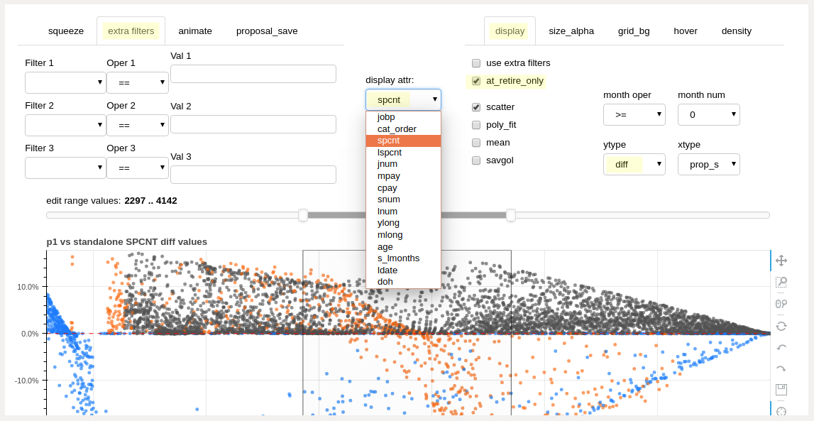
attribute selection dropdown
basic filters
retirement only and month filter controls (display tab)
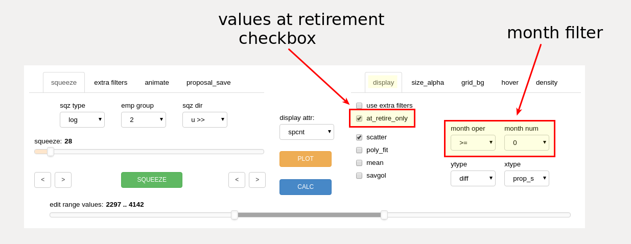
values at retirement checkbox
- ret only checkbox
display only results for employees as measured in their final month of working just prior to retirement
month filter
- month operator dropdown
select operator (such as ‘>=’ or ‘==’) to be used with month number dropdown for display month filtering
- month number dropdown
select month number to be used for display filtering
The month filter is always active, except when the animation feature is in use. Results for all months are displayed by selecting month ‘0’ combined with the ‘>=’ operator.
Month ‘0’ represents the start month for the data model.
A single month of data may be displayed by using the ‘==’ operator combined with a selected month number.
The user may remove the display of pre-implementation information by setting the operator to ‘>=’ combined with the implementation month value.
extra filters
The main chart display output may be further filtered if the user wishes to measure specific segments of the employee group(s). This filtering does not affect overall dataset calculations - only the chart display output is filtered. Up to three display filters may be used simultaneously. This extra filtering is in addition to any month or retirement filtering from the display panel.
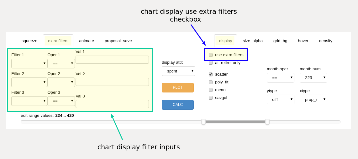
the editor display filter controls
The additional filters will not work if the “filter” checkbox is not checked. Example filters are “ldate <= 1999-12-31”, “jnum == 6”, or “ylong > 30”
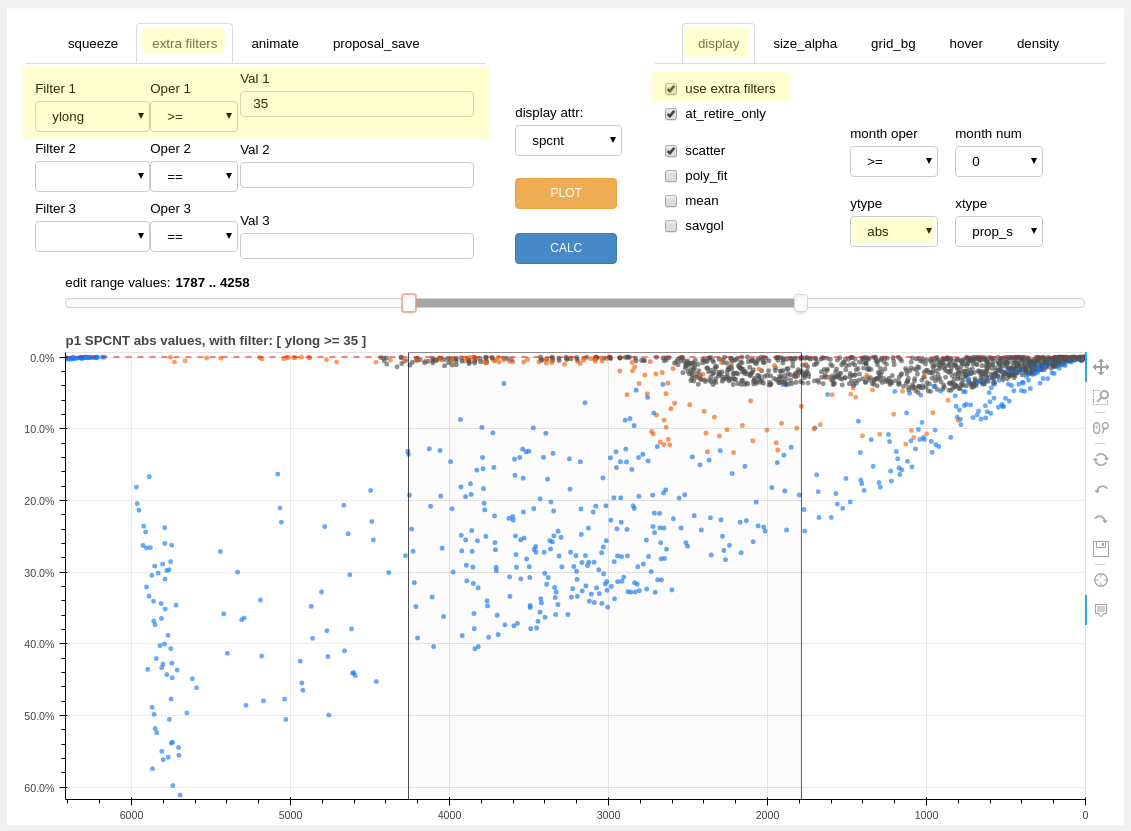
example filtering: seniority list percentage for employees retiring with 35 or more years of longevity, absolute values
marker style and axis mode selection
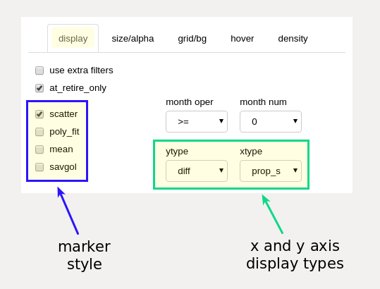
marker style and axis type selection (display tab)
marker style selection
These checkboxes control the aggregate display type for the information presented within the main chart display. All styles differentiate between employee groups by color.
- scatter checkbox
show results as a scatter chart, one dot for each employee result
- poly_fit checkbox
show the results as a smooth polynomial fit line, one line per employee group
- mean checkbox
show the results as an average line, one line per employee group
- savgol checkbox
show the results as a smoothed line, calculated using a Savitzky-Golay filter, one line per employee group
Changes to marker style are reflected immediately on the main chart (no need to use plot button). More than one style may be selected at the same time.
axis mode section
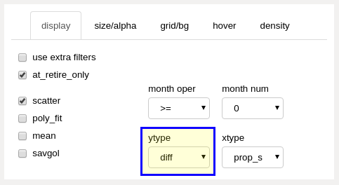
- ytype dropdown
Note: See further description and discussion in the “differential display mode” and “absolute display mode” sections below.
abs (absolute values)
display the actual results for the input (proposal) dataset (non-comparative).
diff (differential values)
display the difference between the same selected dataset attribute between two specified datasets, normally standalone data and another calculated dataset, which could be the results of a proposed integrated list model or an edited model produced from the editor tool itself. Displayed differences may be between any datasets - there is no requirement to compare only with standalone data.
- xtype dropdown
prop_s
an abbreviation for “proposal order, static (or starting)” and is likely to be the most used setting for the display. The main chart displays results with the employee group(s) ordered along the x axis according to the full initial underlying integrated list, which may be a proposal submitted by one of the parties or an edited list. All squeeze operations are performed according to proposal order.
prop_r
an abbreviation for “proposal order, running”. The main chart displays results with the employee group(s) ordered along the x axis according to the underlying integrated list as it would exist at a particular designated month within the data model. With this display, employees advance position ranking as retirements or other factors allow, and those new list positions are used for the x axis positioning.
pcnt_s
“percentage, static”. Same as the “prop_s” display type, with list percentage displayed instead of static list order (seniority) number.
pcnt_r
“percentage, running”. Same as the “prop_r” display type, with list percentage displayed instead of running list order (seniority) number.

editor chart ordered by static integrated list order for a future month
execution buttons

the editor execution buttons (the “SQUEEZE” button is located on the squeeze panel)
execution buttons
- SQUEEZE button
executes a squeeze operation, using the input values from the squeeze slider, the edit zone range slider, and the squeeze selection dropdown boxes
- PLOT button
uses the attribute selection, ytype and xtype selections, month and other applicable filters to display data on the main chart. Plot inputs may be changed between plot displays.
all results correspond to the last calculated dataset, based on all non-squeeze editor tool inputs.
refreshes or creates the data source for hover tooltips
resets the main chart edit zone cursor lines and slider position (Note: use the bokeh “reset” tool button to reset chart scaling, further explained in the “using the bokeh chart tools” section below)
- CALC button
calculates a new dataset based on the most recent squeeze operation and displays the results on the main chart display.
It is not necessary to recalculate the dataset to view various attribute results associated with a resultant dataset. Simply select the desired attribute and filter(s) and click the “PLOT” button. Calculation using the “CALC” button is only required when actually modifiying integrated list order after a squeeze operation.
items highlighted may be changed without recalculating - use the “PLOT” button
differential display mode
differential ytype dropdown selection (display panel)
When a “diff” ytype (y axis) is selected, the difference between attribute calculations from the proposal and baseline datasets will be displayed within the main chart area. Distortions are generally identified by inequitable positive or negative deviation from the norm, as represented by the zero line on the differential chart. By default, the norm (baseline) is defined as the standalone outcome results, but any calculated dataset may be set as the baseline for comparison.
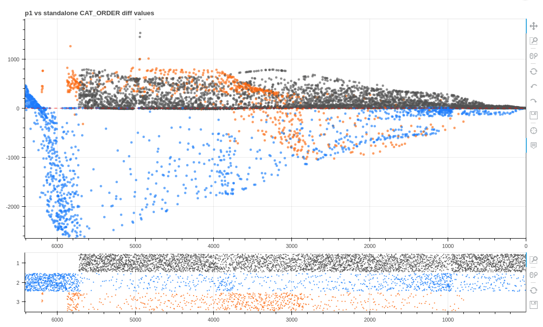
cat_order (job value) differential, proposal p1 vs. standalone
The chart below displays the seniority percentage difference at retirement between sample proposal “p1” and standalone outcomes. In this case, only the average differential is displayed. This type of output is selected with the “mean” checkbox control. The results reveal group 1 employees retiring at a better (more senior) combined seniority list percentage than under projected standalone conditions, and group 2 experiencing a large negative result under the “p1” proposal, as compared to standalone projections.

average differential values proposal “p1” vs. standalone seniority percentage at retirement
absolute display mode
absolute mode dropdown selection (display panel)
When an “abs” ytype (y axis) is selected, the actual attribute calculation values from the dataset defined by the “proposal” dropdown (“proposal_save” panel) will be displayed within the main chart area. Subsequent displayed values will be from the last calculated edited dataset.
The chart below displays the actual seniority list percentage for all 3 groups within the sample dataset at the time of retirement for each employee, smoothed with a Savitzky-Golay filter (“savgol” checkbox on the “display” panel). These results are derived from the same input as the average differential chart above. The results indicate group 2 employees on average will not advance up through the integrated seniority list as far as employees from the other groups prior to reaching retirement under proposal “p1”.

smoothed absolute (actual) values proposal “p1” seniority percentage at retirement
applying conditions
Job assignment conditions may be applied to datasets created with the editor tool function by selecting a condition from the “conditions” dropdown selection on the “proposal_save” panel. Conditions associated with baseline datasets are incorporated and applied when the datasets are constructed with the compute_measures.py script. Conditions applied with the editor tool only apply to datasets created by the editor tool (designated with the “proposal” dropdown selection).
The editor tool will apply job assignment conditions during the construction of the proposed integrated dataset according to the cond_dict dictionary key, value pairs below, with the “condition” dropdown selection as the key and the corresponding value as the condition list to apply.
cond_dict = {'none': [],
             'prex': ['prex'],
             'count': ['count'],
             'ratio': ['ratio'],
             'pc': ['prex', 'count'],
             'pr': ['prex', 'ratio'],
             'cr': ['count', 'ratio'],
             'pcr': ['prex', 'count', 'ratio']}
The conditional job assignment parameters are set within the settings.xlsx spreadsheet input file, and are converted to a python dictionary file for use within the program during the execution of the build_program_files.py script. See the “excel input files” section for the definitions of the various job assignment conditions. Advanced users may wish to directly access and modify dictionaries associated with conditional job assignments located within the dict_settings.pkl file when experimenting with “what if” scenarios.
Results for a precalculated dataset may be viewed by using the “proposal” dropdown selection and then clicking the “CALC” button.
Note: Job assignment conditions (as defined by the “conditions” dropdown selection) will be included within calculated datasets produced and viewed with the editor tool. When analyzing a previously calculated dataset, be sure that the selected conditions match the conditions applied to the original dataset if results containing equivalent conditions are desired. Conversely, the effect of particular job assignment conditions may be analyzed by comparing a dataset without conditions to a baseline dataset which included conditions.
squeezing
If one group is enjoying a windfall in all or only a section of the proposed list while another group(s) is suffering a loss, the corrective action is to reduce the list position of the windfall group relative to the other group(s), and then recalculate for further analysis and adjustment.
controls used when editing an integrated list
A slice of the differential display may be selected by using an interactive slider control (labeled “edit zone” above) which positions two vertical lines on the chart. The area of the chart between the lines represents a section of the integrated seniority list (the “edit zone”).
If a future month(s) filter has been applied to the data displayed, the selected section will be internally converted to include all employees who have already retired prior to the future month. This is done because all editing occurs to the initial integrated list ordering and so that section selections and calculated results sync with the cursor lines display. The lower density chart cursor lines are automatically corrected to show the equivalent beginning month section.
Once the section of the list has been selected, an algorithm within the editor tool is then utilized to “slide” or “squeeze” the members from one of the original employee groups up or down the list. This action creates a new modified order, while maintaining proper relative ordering within each employee group.

squeeze selectors (squeeze tab)
The squeeze algorithm works by one of two basic ways. The first method is a logarithmic move, the second is a position slide move.
The logarithmic method first selects all of the employees from the defined list section, and sets aside the employees who are not part of the employee group to be moved. The “emp grp” dropdown box selection sets the group to be moved. The employees from the target group are then spread throughout the list section in a pattern determined by the “sqz dir” (squeeze direction) and the value set with the “squeeze” slider control. The logarithmic squeeze “packs” employees in one direction or the other so that there is an ever-increasing density of employees filling list slots. The severity of the density differential is set with the “squeeze” slider. If the squeeze is set to the lowest possible value of 1, all employees from the target group are spread evenly within the selected section.
The position slide method simply moves all employees from the selected employee group a certain number of positions one way or the other. The number of positions to move is set with the “squeeze” slider setting. If the requested move would cause target employees to be moved outside of the selected list section, the employees will “pile up” or be compressed at the edge of the section as necessary to stay within the section boundary.

the editor slider controls and value readouts (squeeze tab)
With either squeeze method, employees from the other groups are reinserted into the remaining slots within the selected integreated list section, in pre-squeeze order. The net effect is that the groups trade positions while maintaining order within each group.
Following the squeeze operation, the horizontal list density chart is updated. This represents the new population density within the edit zone as a result of the squeeze. The squeeze may be repeated differently if the density chart indicates an undesired population shift. The list density chart will be updated each time a squeeze operation is performed. The resultant squeeze chart is always presented in integrated list order perspective.
When satisfied with the squeeze, the squeeze-modified integrated list order is then sent back to the dataset creation routine by clicking the “calculate” button. A new dataset is generated using the modified list order (and any selected conditions from the “proposal_save” panel) and the results appear within the main chart display.
The edit process may be repeated many times, each time using the results of the previous operation. The interactive and iterative nature of the editor tool provides the user with a method to rapidly reduce or eliminate observed equity distortions while “drilling down” to possible list solutions.
using the bokeh chart tools
The editor tool was developed using the bokeh plotting library. Many interactive features are “built-in” with bokeh, allowing the user to explore data much more fully than with static charts. The editor tool incorporates a number of these interactive chart tools to allow zooming, tooltip data display, and other features.
The chart tools are located on the right side of both chart displays.
A blue vertical line to the left of a tool icon means that the tool is active. A click on a tool icon will activate/deactivate it.
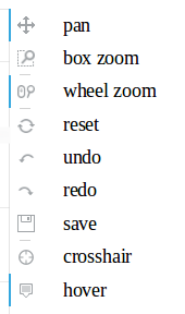
chart tool icons
The tool definitions (paraphrased) below are from the bokeh user guide :
The pan tool allows the user to pan the plot by left-dragging a mouse across the plot region.
The box zoom tool allows the user to define a rectangular region to zoom the plot bounds to, by left-dragging the mouse across the plot region.
The wheel zoom tool will zoom the plot in and out, centered on the current mouse location.
The reset tool will restore the plot ranges to their original values.
The undo tool allows to restore previous state of the plot.
The redo tool reverses the last action performed by undo tool.
The save tool allows the user to save a PNG image of the plot.
The crosshair tool draws a crosshair annotation over the plot, centered on the current mouse position.
The hover tool is an inspector tool.
Controlling main chart auto-scaling
using the box zoom or wheel zoom will “lock” chart scaling
this is helpful during animation, so that the chart is not continuously rescaling to accommodate changing data values (can cause slow or jerky animation)
hint: one small mouse wheel move forward and backward using the wheel zoom tool will easily lock scaling
click the reset chart tool icon to reset auto chart scaling
a locked chart scale may mean that nothing is seen after changing a display attribute and plotting until auto-scaling is reset
editor function inputs
The inputs described here are related to the actual editor function arguments, not the inputs made through the various dropdown, check boxes, sliders, and buttons which are displayed above the main chart.
The editor function inputs (arguments) are described within the function docstring, accessed as described in the “notebook interface” section below. The inputs are related to items concerning smoothing values for the various display options, and other sizing and appearance options less commonly altered when running the editor tool.
To change one of the parameters, insert the key value definition within the partial method after the editor function.
Example:
handler = FunctionHandler(partial(ef.editor,
                          plot_width=800,  # change plot width
                          plot_height=450,  # change main plot height
                          ema_len=30  # adjust exponential moving average length
                         ))
The default settings for the optional inputs will be changed to the new values. The new values will be used when the editor tool is created by the program.
editor output
The editor produces a dataframe containing the edited list order and a calculated dataset based on that edited list order. A small python dictionary is also generated to allow the tool settings to persist between iterations. All of these files are stored as pickle files within the dill folder.
The list order dataframe is named p_edit.pkl. It is like other proposal files, containing an index consisting of employee numbers and one column representing list order number.
The dataset produced from the editor tool is stored as ds_edit.pkl. It may be fully examined and visualized in the same manner as other datasets. Edited datasets are not automatically stored when the “CALC” button is clicked. To store an edited dataset, the user must click the “SAVE EDITED DATASET” button on the “proposal_save” panel.
The small dictionary file is named editor_dict.pkl. This file does exist with default values prior to any editing and will be updated with actual editor tool settings as the program is used.
The edited dataset, ds_edit.pkl, is only created/updated when the “calculate” button is clicked. The other two files, p_edit.pkl and editor_dict.pkl, are created/updated every time the “SQUEEZE” button or the “CALC” button is clicked.
summary
The editor is a fast and powerful tool, extremely useful for detecting relative gains or losses or comparing actual outcome values for each employee group under various proposals. It is able to dynamically adjust input list data based on calculated output metrics. Resultant equity distortions may be identified, measured, and corrected interactively. The editor tool offers tremendous flexibility to compensate as necessary throughout the entire range of a combined employee population. This capability provides users with the opportunity to construct integrated seniority lists based on objective data while compensating for unique demographics existing within each employee group list. Results are measurable and transparent. This is a huge distinction and profound improvement from integrated list construction processes which employ uniform list combination formulas, or other non-outcome-based techniques.
The seniority_list program provides the user with insight into the most important aspect of seniority integration: the way a combined list will affect workers for the remainder of their careers. The editor tool feature allows the user to create a solution foundationally focused on fair, equitable, and quantifiable outcome for all workers.
Edited lists may be analyzed, confirmed, and adjusted with reference to the other tools available with seniority_list, so that results are further validated and cross-checked. Each case study will likely require a blending of analysis techniques to reach an equitable solution.
building lists
Processing scripts: list_builder.py, join_inactives.py
seniority_list was designed primarily as an instrument to discover the practical short- and long-term results of various integrated seniority list proposals by calculating, measuring, and comparing multiple attribute metrics, and to correct deficiencies by using the editor tool feature. However, it may also be used as an initial integrated list construction tool by utilizing a weighted-ratio, or “hybrid”, combination technique.
To build a hybrid list, import the list_builder module. Then run the build_list function using the prepare_master_list function as the first argument, and lists of attributes and corresponding weightings as the other arguments. The function produces a new list ordering which can then be used as input for the dataset creation routine. The new hybrid list order is stored in the dill folder as “hybrid.pkl”. The build_list function is able to combine any number of employee groups simultaneously.
Example, with equal weighting applied to longevity and job percentage:
import list_builder as lb

lb.build_list(lb.prepare_master_list(),
              ['ldate', 'jobp'],
              [.5, .5])
After a integrated list solution has been determined, a final list must be built which reinserts inactive employees who were removed prior to the analysis process. This task is accomplished with the join_inactives.py script.
The arguments required by the join_inactives.py script are:
the name of the proposal dataframe containing the final order solution, without “p_” prefix or file extension. The argument representing proposal dataframe p_p3.pkl would set as “p3”.
the “fill style” or cohort placement technique for the inactive employee insertion.
If the proposed list ordering does not contain the inactive employees, the “fill_style” argument determines where the inactive employees will be placed within the combined list relative to their same employee group active cohorts, just senior to the closest junior cohort or just junior to closest senior cohort.
“ffill” - inactives attached to just senior same-group cohort
“bfill” - inactives attached to just junior same-group cohort
The result list/dataframe is stored as a pickle file with the name final.pkl (within the dill folder) and as an Excel file with the name final.xlsx (within the case-specific folder located in the reports folder).
Example usage from within a notebook cell:
%run join_inactives p3 ffillThis integrated list result including active and inactive employees in concert with with any associated conditions represents the ultimate end goal of the seniority_list program.
notebook interface
This section will provide a basic primer to the Jupyter notebook, run through a short demo of the program using the notebook, and provide guidance in the event that the program needs to be reinstalled if it becomes inoperable for some reason.
From the Project Jupyter homepage:
From the predecessor IPython notebook original webpage (the Jupyter notebook was originally the IPython notebook):
The name “Jupyter” is a combination of three programming language names, Julia, Python, and R. It is actually capable of running code in over forty different languages, not just the three making up its name.
seniority_list was designed to utilize the Jupyter notebook for running scripts, creating datasets, and exploring and visualizing data.
The Chrome web browser is recommended for use with seniority_list for best performance.
notebook basics
starting the notebook
To run a notebook, open a terminal window or powershell and then type or copy and paste:
jupyter notebookA browser window will open containing a file listing. Navigate to one of the Jupyter notebook files (ending with a .ipynb file extension, above) and click on the file name. The notebook will open.
imports
Python files containing functions (modules) may be imported or loaded for use within a notebook by using the “import” statement. Once a module has been imported, the program “knows” about all the functions from that module. A module is imported and assigned an alias, or shortened name as follows:
import matplotlib_charting as mpNow, all of the plotting functions may be run from the notebook, and tab completion is active. By typing the import name (“mp” in this case) followed by a dot, the user may then hit the TAB key for a list of all of the functions available for use from the imported module. The function may still be typed in manually or selected from the list presented with the tab completion feature. Select from the list using the up and down arrows and the ENTER key.

type mp. then TAB to reveal a list of functions available from the matplotlib_charting module
running cells
The Jupyter notebook is a web interface which consists of a collection of ‘cells’ normally containing program code. The code may be executed with the results appearing beneath the cell, if there is actual output from the code. To execute a cell, it must be ‘active’ (click on it). Then hit “Shift + Enter” on the keyboard to run it. There is also a “run” button in the notebook header section that will work as well.
Sometimes the type of cell changes to something other than “code”, which will prevent the execution of the cell. The type of cell may be changed back to “code” with a dropdown box in the notebook header section.
There are numerous free tutorials and other educational materials on the web pertaining to the use of the Jupyter notebook (formally known as the Ipython notebook). Here is one video which may be of interest to new users.
running scripts within cells
Several of the program files are Python scripts used to perform major program tasks. The work performed by the scripts is described in the “program flow” section above. Below is a summary table containing required and optional arguments for each program script.
script
required arguments
optional arguments
build_program_files
case name
none
make_skeleton
none
none
standalone
none
prex
compute_measures
proposal name
conditions
join_inactives
order, fill
none
case name - the case study name (the name of the folder containing the input files)
prex - if a pre-existing job condition exists, use “prex” to direct the program to apply a special job assignment condition as defined in the settings.xlsx input file
proposal name - name of a proposed list ordering, such as “p3”, originally set from worksheet names in the proposals.xlsx input file. Names of the proposals may also be read from the proposal_names.pkl file within the dill folder.
conditions - string name representing various conditional job assignment routines. Choices are:
['prex', 'ratio', 'count']A “ratio” or “count” condition may be combined with the “prex” condition.
The “excel input files” section of the documentation contains descriptions of the condition options. The parameters for the conditions are set through the settings.xlsx input file.
order - a dataframe formatted with an index of empkeys and a single column with an order number, named either “idx” in the case of an original proposal or “new_order” when using the output of the editor tool.
fill - the fill style to use which determines how the inactive employees are reinserted into the integrated list. See the “building lists” section above.
A script may be run from a Jupyter notebook cell by inserting the special command, “%run”, before a script name, and then hitting “Shift + Enter” on the keyboard to run the cell and execute the script. The following code will execute the compute_measures.py script for proposal “p2” with a ratio count-capped condition applied. The first line, “%%time”, will provide the user with a print out of the amount of time it took to complete the script task:
%%time
%run compute_measures p2 count
function docstrings
Click on function name within a cell, then Shift+TAB keyboard combination to reveal the function docstring. Another way to do the same thing is to type the name of a function followed by a question mark and then run the cell:
mp.quantile_years_in_position?The information displayed may be expanded by clicking on the ^ or + symbols in the upper righthand corner of the docstring window.
click on function name, then Shift+TAB to reveal docstring, or type the name of the function with a question mark, then run cell
The docstrings contain descriptions, instruction, and input definitions for the many program functions of seniority_list. The docstring may in fact be the best source of information concerning the usage of a function.
The “program demonstration” section below has more information about function docstrings.
functions and variables
The function variables visible within the notebook cells are contained within parentheses following the function name. The order of the variables is important and must be maintained for the function to operate. Other variables may not be displayed within the notebook code cell and are defined with default values within the function definition itself. It is likely that they may changed to another value by the user.
To view the full function code, a text editor may be used to open the appropriate module and search for the function name. Be careful not to change anything within the module to ensure proper program function. When using the notebook, function code may also be viewed by using two question marks after a function name, as follows:
mp.quantile_groupby??A window containing the function code will open in the lower section of the notebook.
If a change is made to any seniority_list program code, please submit a pull request or send an email with the change as required by the licensing terms of the program. Please see the “contact” section for the developer email address.
exiting the notebook
To discontinue use of the notebook, save all notebooks and close the notebook browser windows. Then use the keyboard combination CTRL+C within the terminal to shut down the notebook server.
sample notebooks
Four sample Jupyter notebooks are included with seniority_list.
RUN_SCRIPTS.ipynb
STATIC_PLOTTING.ipynb
INTERACTIVE_PLOTTING.ipynb
REPORTS.ipynb
EDITOR_TOOL.ipynb
As mentioned on the installation page, the Jupyter notebook is included and installed with the Anaconda scientific platform.
The RUN_SCRIPTS notebook creates many files and the datasets from the sample files included with seniority_list, and will provide a feel for the capability and speed of the program.
The STATIC_PLOTTING notebook runs many of the built-in plotting functions using the datasets produced from the Run_Scripts notebook. This notebook provides a platform for practice exploring, plotting, and analyzing datasets. The “STATIC” part of the notebook title simply means that the chart output is not interactive.
The INTERACTIVE_PLOTTING notebook was added to the program in January of 2018. It offers chart output which can be modified within the notebook in real time using sliders and dropdown selections.
The REPORTS notebook demonstrates the generation of summary statistical reports for all program datasets, with output in spreadsheet and chart image formats. This feature is described in the “quick report” section of the documentation.
The EDITOR_TOOL notebook will load the interactive editor tool. Please review the “editing” section above for the powerful visualization and editing features available with this function. This function will only run within the Jupyter notebook interface.
Note: The RUN_SCRIPTS.ipynb notebook must initially be run prior to the other sample notebooks included with the program. The other notebooks require the dataset files which are created by the RUN_SCRIPTS.ipynb notebook.
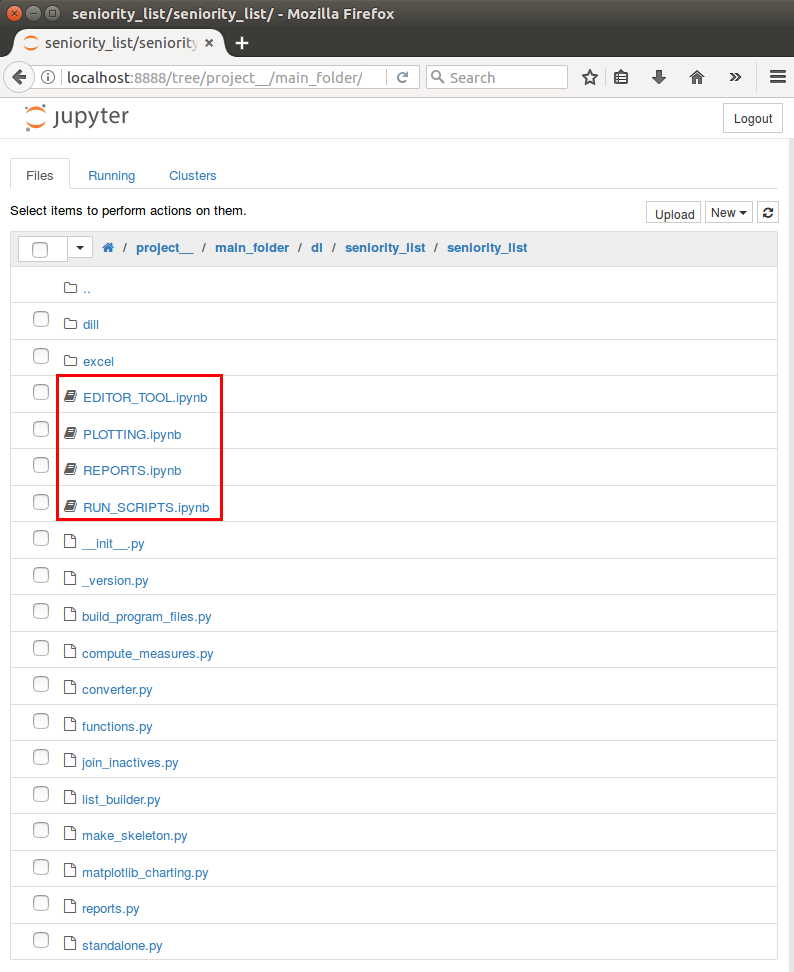
click on a file with the .ipynb file extension
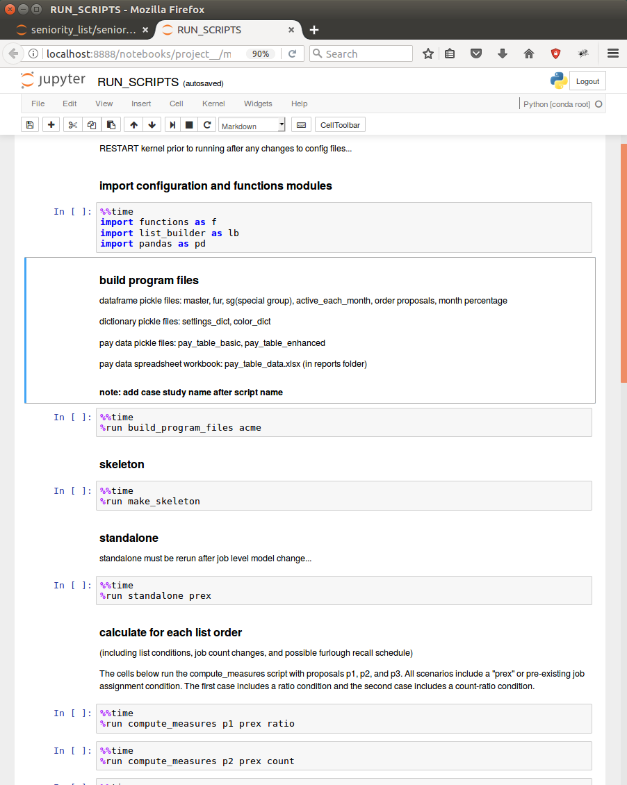
the Jupyter notebook in the browser, with code cells waiting to be run
To run the notebook, click on “Cell” and then from the dropdown menu, select “Run All”. If all goes well, the notebook will load the required data, run each section of code (“cells”), and display results below each cell.
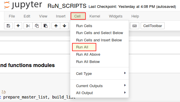
running the sample notebooks
To view the files which were created during the Run_Scripts notebook execution, use a file explorer to view the contents of the program dill folder.
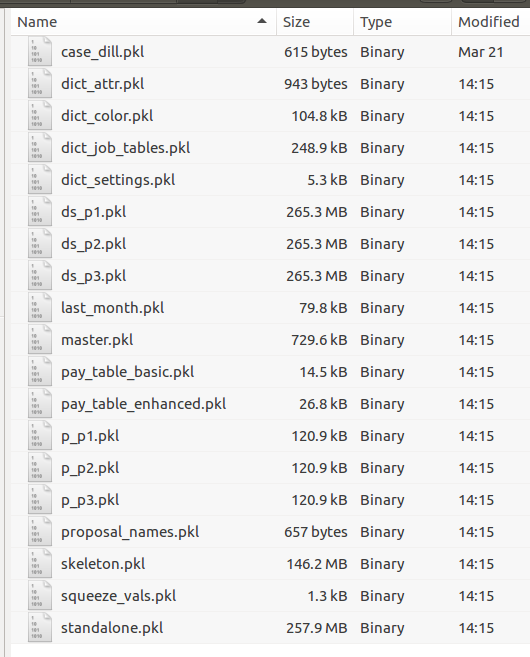
files created by Run_Scripts.ipynb
Note that the dataset files (starting with “ds”) are large at 260mb+. and are generated from a sample list of approximately 7500 employees. The files depicted above were generated utilizing the sample case study, “Sample3”, which includes approximately 7500 employees from 3 separate employee groups and 3 different integrated list proposals.
There is one other file created, pay_table_data.xlsx, an Excel file stored in the reports folder (not shown here).
The screenshot below is an example of matplotlib charts displayed within the sample STATIC_PLOTTING notebook. Notice that just above each chart area there is a cell which contains the plotting function which created the charts. The inputs to the functions may be modified directly within the notebook and re-executed, creating new chart results in seconds.
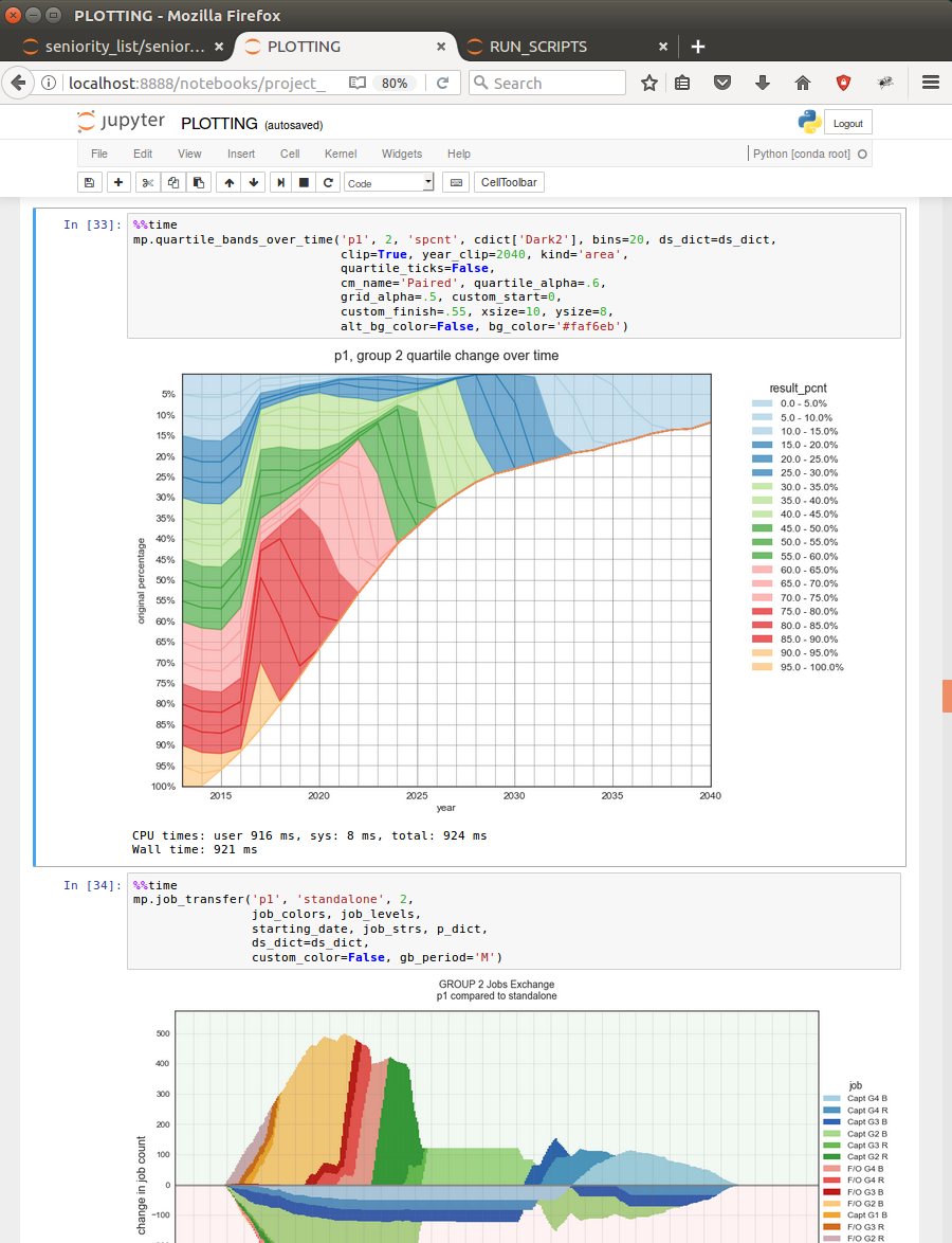
changing function inputs produces new results in real time…
program demonstration
This demo will walk through the steps involved with setting up and analyzing a new case study. It is assumed that the program has been downloaded in accordance with the “installation” section of this documentation.
Note
To run the demo using the included sample dataset, “Sample3”, no modification of files is necessary - simply run the included notebooks in the order within the description below.
The screenshots below were taken while using a linux operating system. The information may be presented differently with other operating systems, but the actions remain the same.
new case study
set up inputs
Navigate to the seniority_list folder within the main seniority_list folder with a file browser
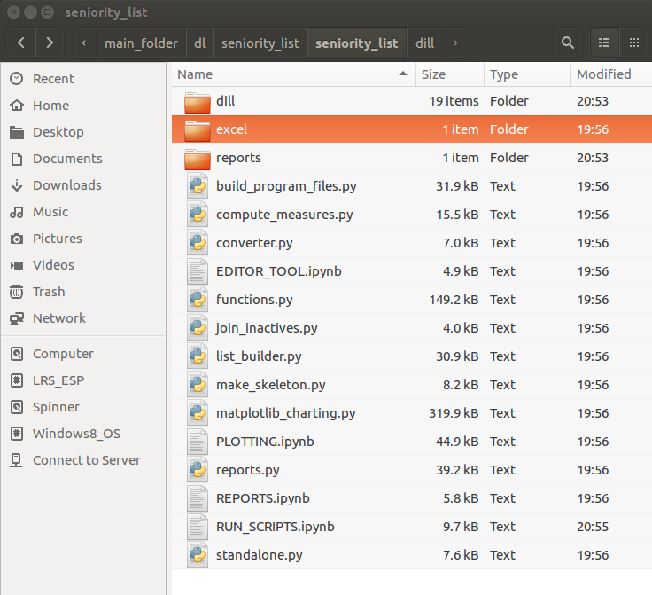
the seniority_list folder within the main seniority_list folder…
Copy a case study folder within the excel folder (sample3 is fine)
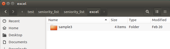
inside the excel folder, home of the case study input folders…
Paste the folder back into the excel folder and rename it t match the desired case study name - this example will use “acme”
Modify the contents of the Excel workbooks within the acme folder as appropriate, using the “excel input files” section of the documentation as a guide
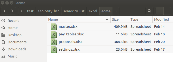
the four .xlsx files ready for case study customization
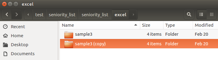

set up jupyter notebook
Open a Jupyter notebook and navigate to the seniority_list folder containing the 5 sample notebooks (.ipynb files).
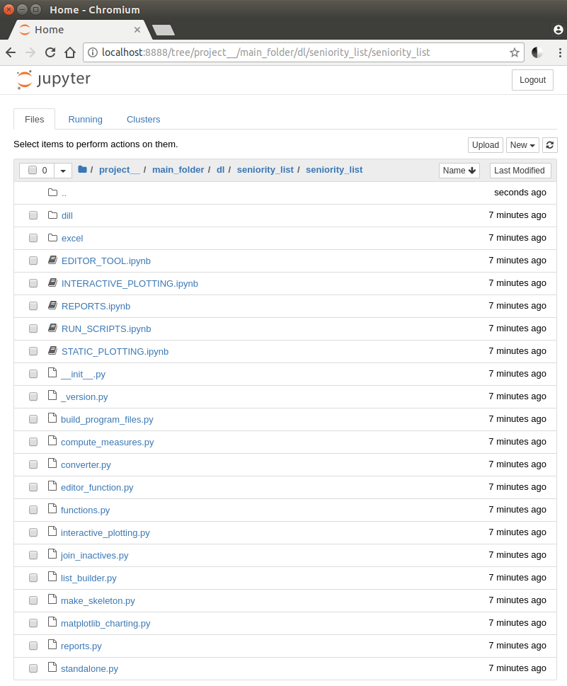
the seniority_list folder in the jupyter notebook
Open the notebooks by clicking on the titles - a new browser tab will open for each notebook
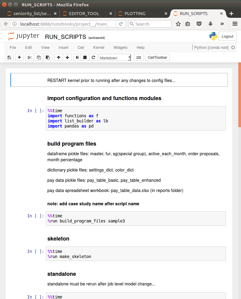
a browser tab for each notebook, with the RUN_SCRIPTS notebook displayed
Modify the script arguments in the notebook cells to match the new arguments which pertain to the current case study.
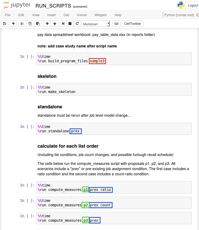
case study marked red, conditions marked blue, proposal names marked green
RUN_SCRIPTS notebook
case study name for build_program_files script
condition argument(s) for standalone and compute_measures scripts
proposal names for the compute_measures script cells (one for each proposal)
STATIC_PLOTTING notebook
proposal string inputs to match proposal name(s)
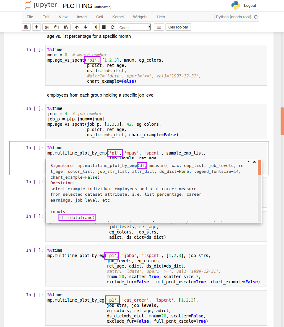
plotting functions inputs matching a proposal name
The functions have been coded so that they can accept the name of an integrated list proposal as an input to represent a dataset calculated from that proposal. Consequently, the inputs must match the proposal names which are part of the current case study. The source of these names are the worksheet names within the proposals.xlsx input file.
create program files and datasets
Run the RUN_SCRIPTS notebook
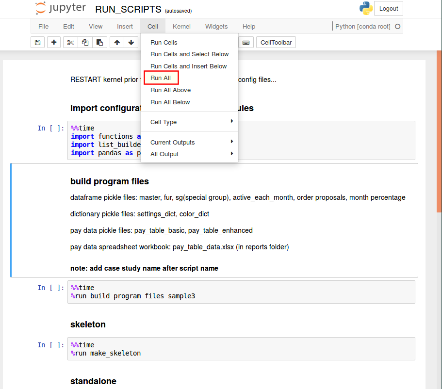
select the “Cell” button from the menu bar, then click “Run All”
the contents of the dill folder will be cleared and the folder will then be repopulated with program files and datasets pertaining to the “acme” case study.
open the dill folder in a file browser to see the files populate the folder in real time…
analyze datasets
Run the REPORTS notebook
A statistical summary of proposed integrated list outcomes will be generated, in the form of chart images and spreadsheets.
ret_charts and annual_charts folders will be created within the reports folder. Each of these folders will contain several other folders with many basic chart images.
ret_stats.xlsx and annual_stats.xlsx spreadsheet files will be created within the reports folder.
Run the STATIC_PLOTTING notebook (with the correct proposal name argument(s)
this will run the sample plotting functions with parameters set as they existed when the program was downloaded.
Modify plotting function arguments as necessary for analysis (see docstrings)
there are many options associated with most of the plotting functions
view the docstrings as described in the section above to learn about the analysis possibilities with each function
The images below demonstrate a sample of possibilities with one plotting function, quantile_groupby.
The function groups an initial list of employees into equally sized segments and tracks each segment over time according to a selected metric. The result for each segment is displayed as a line on the chart. This technique provides a quick view into how employees at various levels within a seniority list fare under standalone and integrated scenarios.
The program generates a global job ranking metric, termed “cat_order” which stands for category order. Standalone dataset “cat_order” results are normalized with integrated results, allowing direct comparisons to be made between them.
The job ranking “cat_order” value is closely related to the “jobp” metric, which reflects percentage of position within a job level, with the advantage of true scaling for chart presentation. In other words, job levels with many jobs occupy a larger part of the chart than job levels with few jobs.
The first image below is an example of the quantile_groupby function output displaying the results for the “cat_order” measure for one employee group in a standalone scenario, as grouped into 40 quantiles.
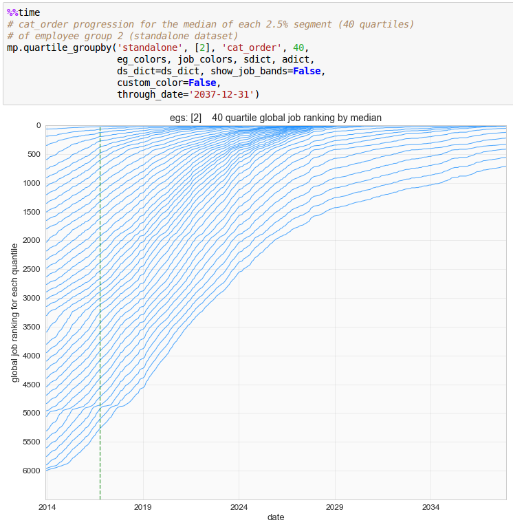
standalone dataset, employee group 2, category order (job ranking), 40 quantiles
Here is the same group, with the first argument changed to an integrated proposal, “p1”. The computed scenario included a delayed implementation date, indicated with the dashed vertical date line and the sudden change in the progression of the lines.
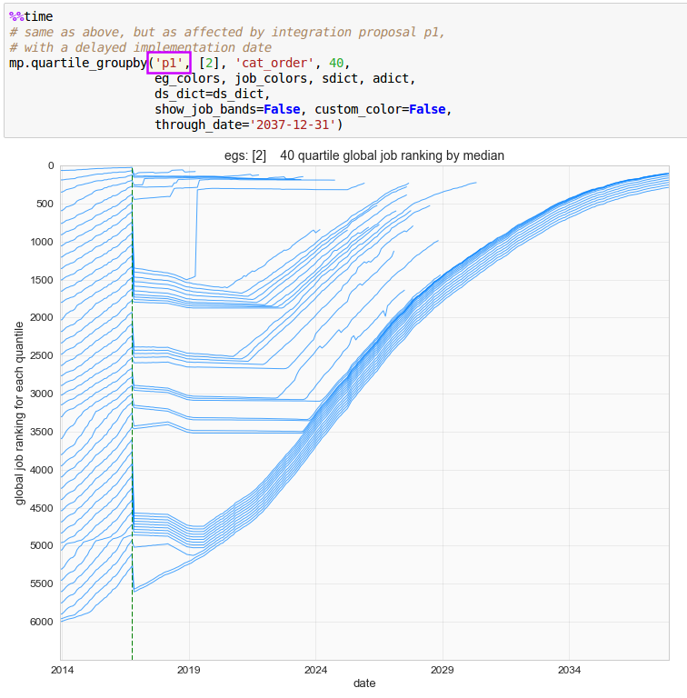
p1 dataset, employee group 2, category order (job ranking), 40 quantiles
The “show_job_bands” option changed to “True”. A background job level hierarchy is now shown, and the sudden changes in the progression of the chart lines begins to gain context.
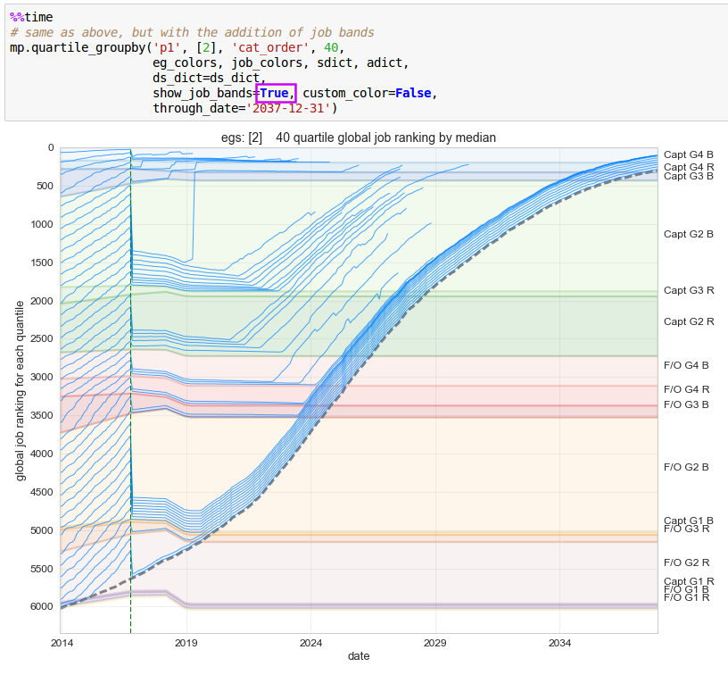
p1 dataset, employee group 2, category order (job ranking), 40 quantiles, with job bands
Here, the number of quantiles input was changed to 250 to produce a much denser presentation and a custom color spectrum was introduced, allowing a much clearer visual presentation of the outcome.
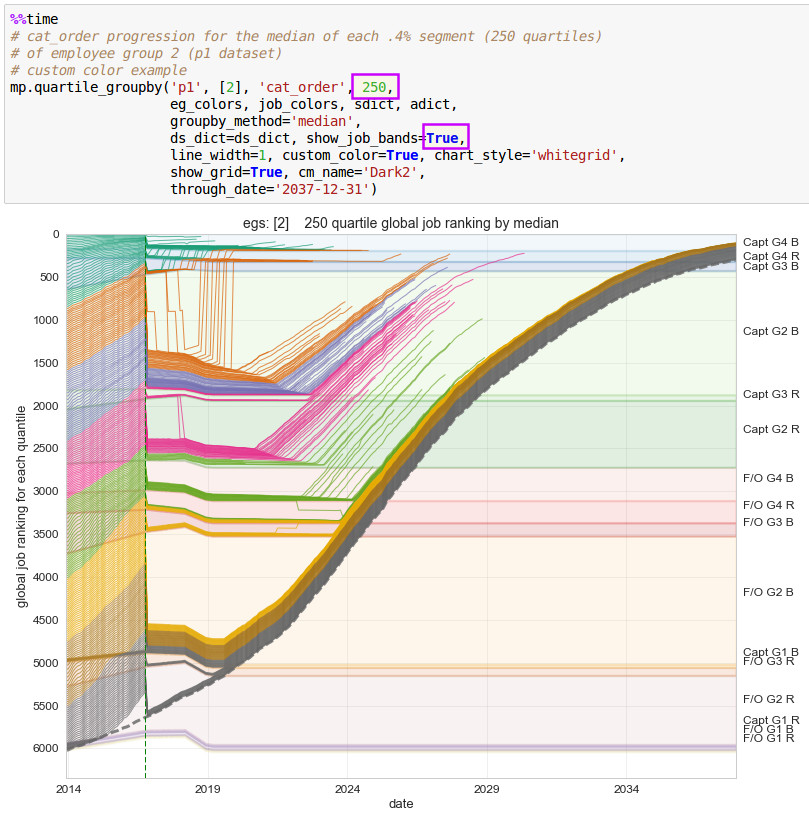
p1 dataset, employee group 2, category order (job ranking), 250 quantiles, custom_color, with job bands
Every function has a list of all possible inputs and a description of those inputs contained within what is known as a docstring (documentation string (text)). The docstring may be viewed by clicking on the function name within a jupyter notebook cell, and then pushing the Shift + TAB keys at the same time.
The function docstrings also contain an overall description of the task performed by the function.
Docstrings may also be viewed within this website by clicking on the home button and then scrolling to the bottom of the page and clicking the “Index” or “Module Index” text. Full function code may be accessed by subsequently clicking on the “[source]” text found after each function name. The top section of each function code section will contain the docstring.
Below, a docstring has been accessed within the jupyter notebook. The first four arguments in the quantile_groupby inputs correspond to the first four parameters listed in the docstring (or more technically here, the Signature).
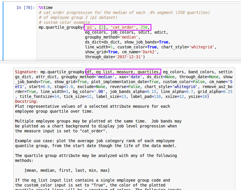
function docstring accessed by clicking cursor on top of function name in the notebook cell, then pushing Shift + TAB keyboard buttons
Further down within the docstring associated with this function are the input descriptions. The descriptions provide information pertaining to the data type of each input and sometimes a short explanation of the purpose or effect of the input.
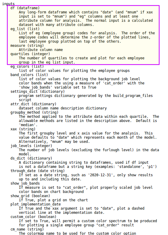
beginning of input definitions for sample function
Note that the quantile_groupby function can present information relating to other metrics, not just the “cat_order” measure. It can also display more than one employee group at a time. These are more options which are easily selected by changing the function argument values.
Global settings which affect the way the datasets are calculated are controlled by values in the Excel input files. The function arguments only control how the previously calculated dataset information is displayed.
Run the INTERACTIVE_PLOTTING notebook
select attributes to compare with the dropdown selectors
use the slider and buttons to view data model results over time
change the “proposal” variable as needed to explore other datasets
create or edit lists
Run the EDITOR_TOOL notebook
modify list order to smooth distortions (see the “editing” discussion within the “program flow” section)
generate final list
Run the join_inactives script
reinsert inactive employees into the integrated list solution (see the “building lists” discussion within the “program flow” section)
changing program options or settings
Global settings include such things as basic vs. enhanced job hierarchies, delayed implementation, and changes in job counts over time. Datasets must be recalculated when any foundational parameter is modified.
To change a global program option, the input(s) within the Excel input file(s) must be modified and the program rerun as follows:
Changing main program input options or other parameters:
Open the appropriate Excel input file.
Change the value
Save the Excel file
Return to the Jupyter notebook
Restart the kernel:
click on the “Kernel” button in the menu bar and select “Restart”
then rerun notebook cells:
click on “Cells” button in menu bar, select appropriate item
Rerun program (generate program files)
recalculate the datasets, rerun the following scripts:
build_program_files
make_skeleton
standalone
compute_measures (for each proposal)
Restart other notebook kernels
rerun all analysis to reflect updated source data
Restarting the kernel flushes all previously loaded variable values. When notebook cells are rerun, the program will use any updated values derived from modified input files. If the notebook is not restarted after changing input file values or recalculating a dataset, it will not capture the updated values. The kernel must be restarted individually for all open notebooks - restarting the kernel for the RUN_SCRIPTS notebook will not restart the kernel for the STATIC_PLOTTING notebook, for example.
Plotting function arguments may be changed within a notebook cell and the cell rerun without any other action (a kernel restart or file saving beforehand is not required or desired).
saving/loading calculated case study data
The save_and_load_dill_folder function may be used to quickly switch between case studies by loading previously calculated and saved program-generated files (including calculated datasets).
saving
The “save” functionality will copy the current dill folder and save it in the saved_dill_folders folder, named as <case study name>_dill_folder. The saved_dill_folders folder will be created if it does not already exist. The function will perform the save action when it is executed without any arguments:
import functions as f

f.save_and_load_dill_folder()
The case study name will be automatically determined by reading the dill/case_dill.pkl file.
saving and loading
The “load” functionality will save the current dill folder, look for a saved dill folder corresponding to the string parameter provided to the “load_case” argument, and replace the current dill folder with the dill folder to load.
f.save_and_load_dill_folder(load_case='sample3')If the specified load folder does not exist, the only action to occur will be saving the current dill folder. The function will alert the user that the load operation failed.
Here is an example of attempting to load a folder which does not exist:
f.save_and_load_dill_folder(load_case='bad_case_name')…will give:
'"sample3" dill folder copied to:'

    'saved_dill_folders/sample3_dill_folder'


  '''Error >>>  problem finding a saved dill folder with a "bad_case_name" prefix in the "saved_dill_folders" folder.'''
The dill folder contents remain unchanged.
query for saved folders
The user may determine which case study dill folders are available to load by running the function with the “print_saved” argument set to True. All saved case study names will be printed and no other action will take place:
f.save_and_load_dill_folder(print_saved=True)The print output will be in this format (the names of the case studies are examples only):
'The saved dill folders available to load are:'

  ['sample3', 'acme_southern']

'Nothing changed, set print_saved input to "False" if you wish to save and/or load a folder'
anonymizing input data
The parties involved with an integration may consider certain input data attributes to be private and confidential, making it difficult or impossible to share the analysis results with others. seniority_list includes a set of specialized functions designed to address this issue.
Employee information - name, employee number, date of birth, date of hire, and longevity date - may be replaced with substitute values to de-identify personal information. Compensation tables may also be proportionally adjusted. This shielding of personal information offers a potential solution to privacy or proprietary concerns.
Anonymizing dates should be avoided if possible to avoid deviations from the original data model, due to the effect on retirements and other date-related measurements. The random date adjustments are small, but will invariably affect the results, even if slight.
The anonymizing functions are located within the functions module.
anon_master
anon_pay_table
Warning
Even though the anonymizing functions are coded to create a copy of original data, it is recommended to copy and save the entire excel folder outside of the seniority_list file structure before applying any of the anonymizing methods.
Internally, the anon_master and anon_pay_table functions use the “sheet_name=None” option of the pandas read_excel method to return a dictionary of worksheets with worksheet name, dataframe as key, value pairs. The targeted worksheet (now represented as a dataframe) is selected and updated with anonymized values. Then the updated dataframe is written back to the appropriate worksheet within the excel file.
Simply rerun the program to produce datasets and visualizations incorporating the anonymized personal information.
anonymize master.xlsx
The aptly named anon_master function is used to anonymize the master.xlsx file. The user may select to anonymize any or all of the following attributes:
last names (lname)
employee numbers (empkey)
birth date (dob)
hire date (doh)
longevity date (ldate)
A copy of the original master.xlsx file will be saved as master_orig.xlsx.
The function will generate new employee numbers (empkey) and last names (lname) by default.
All of the names in the “lname” column will be replaced with randomly generated substitute strings, and all empkeys will be replaced with substitute integer values. Empkeys will still begin will the appropriate employee group code number.
import functions as f

f.anon_master(<case name>)
Note
The <case name> placeholder in the code examples must be replaced with the string name for the case study, such as “sample3” or “acme”.
To anonymize any or all of the date columns, set the “date” option to True.
f.anon_master(<case name>, date=True)The default action is to adjust hire dates and longevity dates together from zero to five days forward, and separately (with different random sequence) adjust birth dates forward in the same fashion. These parameters are all adjustable with various inputs.
Another option related to randomizing date, “sampling”, is also available to the user either through an option with the anon_master function, or by using the sample_dataframe function directly. Using the anon_master function, a sample, or subset, of a master list (by rows) may be randomly selected for testing or other purposes by setting the “sample” option to True. Sample size may be set with with a row count (“n”) input or by a decimal fraction (“frac”) input. Below, the “frac” input will direct the program to randomly select .2 or 20% of the rows in the master_df dataframe for the output.
f.anon_master(<case name>, sample=True, frac=.2)All or none of anonymizing options discussed above may be applied to a master dataframe sample.
The modified excel file output from the anon_master function will be saved as excel/<case name>/master.xlsx.
anonymize pay_tables.xlsx
The underlying compensation information for the data model may be replaced with substitute data using the anon_pay_table function. The original hourly pay data may be reduced or increased, proportionally or disproportionally. A copy of the original pay date will be stored as pay_tables_orig.xlsx.
import functions as f

f.anon_pay_table(<case name>)
The “mult” input is a multiplier used to proportionally transform all of the pay rate data at once. The “mult=.5” input below would produce modified pay rates equal to 50% of the original rates.
f.anon_pay_table(<case name>, mult=.5)The pay rates data may also be “randomized” in a disproportionate manner by setting the “proportional” input to False. The data will be altered with a fixed algorithm.
f.anon_pay_table(<case name>, proportional=False)
reversion to original data
The copy_excel_file function includes a “revert” option which will delete an anonymized file and replace it with the original data.
Restore the master.xlsx file:
f.copy_excel_file(<case name>,
                  'master',
                  revert=True)
Restore the pay_tables.xlsx file:
f.copy_excel_file(<case name>,
                  'pay_tables',
                  revert=True)
program restoration
If for some reason, a portion of the code base is accidentally deleted or corrupted, simply save all custom input files to a directory outside of the main seniority_list folder, then delete the main seniority_list folder and reinstall the program. After reinserting the input files in the proper locations, the program will be ready to operate again.
Specific files to preserve for reinsertion after reinstalling the program:
entire case-specific folders within the excel folder which hold Excel input files
any edited lists (p_edit.pkl) and/or datasets (ds_edit.pkl) from use of the editor tool
All other files are quickly reproduced when the program is run.